


[COVID-19] To help mitigate COVID’s impact on small businesses, Kolau is waiving the fee to create a FORBES™ Award-Winning website with e-commerce enabled.
Create your website quickly and easily clicking here – Offer available for a limited time only.
So, you’ve created an ad and people are clicking on it. It’s working… Until they get to your landing page. For some reason, the clicks aren’t converting. Maybe you haven’t spent enough time on creating an effective landing page. Maybe you’re not linking to a landing page at all. Maybe you included as much information as you could, thinking the more the better.
In fact, it’s better to keep things simple. Simplicity is one of the most important things to focus on while creating an effective landing page. Keeping it simple and straightforward (KISS), especially for landing pages, is the best road to success.
It’s easy to make mistakes when it comes to designing your landing page and it’s hard to have a solid marketing strategy without a landing page at all. After someone clicks on your ad, you still have to convince them to take action.
A landing page is the best way to do that as its only purpose is to convince visitors to convert. Because of this, you should create a marketing strategy specifically for your landing page. You’ll find your visitors will convert better once you do.
What is a Landing Page?
Landing pages have, not unexpectedly, changed a lot in the past decade. In the early 2000s, landing pages were only barely beginning to surface and they certainly didn’t look like the ones we have today.
Landing pages once looked like what you would imagine an old-fashioned homepage looked like–full of small text with few or no pictures. As time went on, landing pages began to use bigger text and put more focus on pictures and videos. It wasn’t until around 2012 or 2013 that webpages (including landing pages) began to look more like the visually pleasing pages we know today.
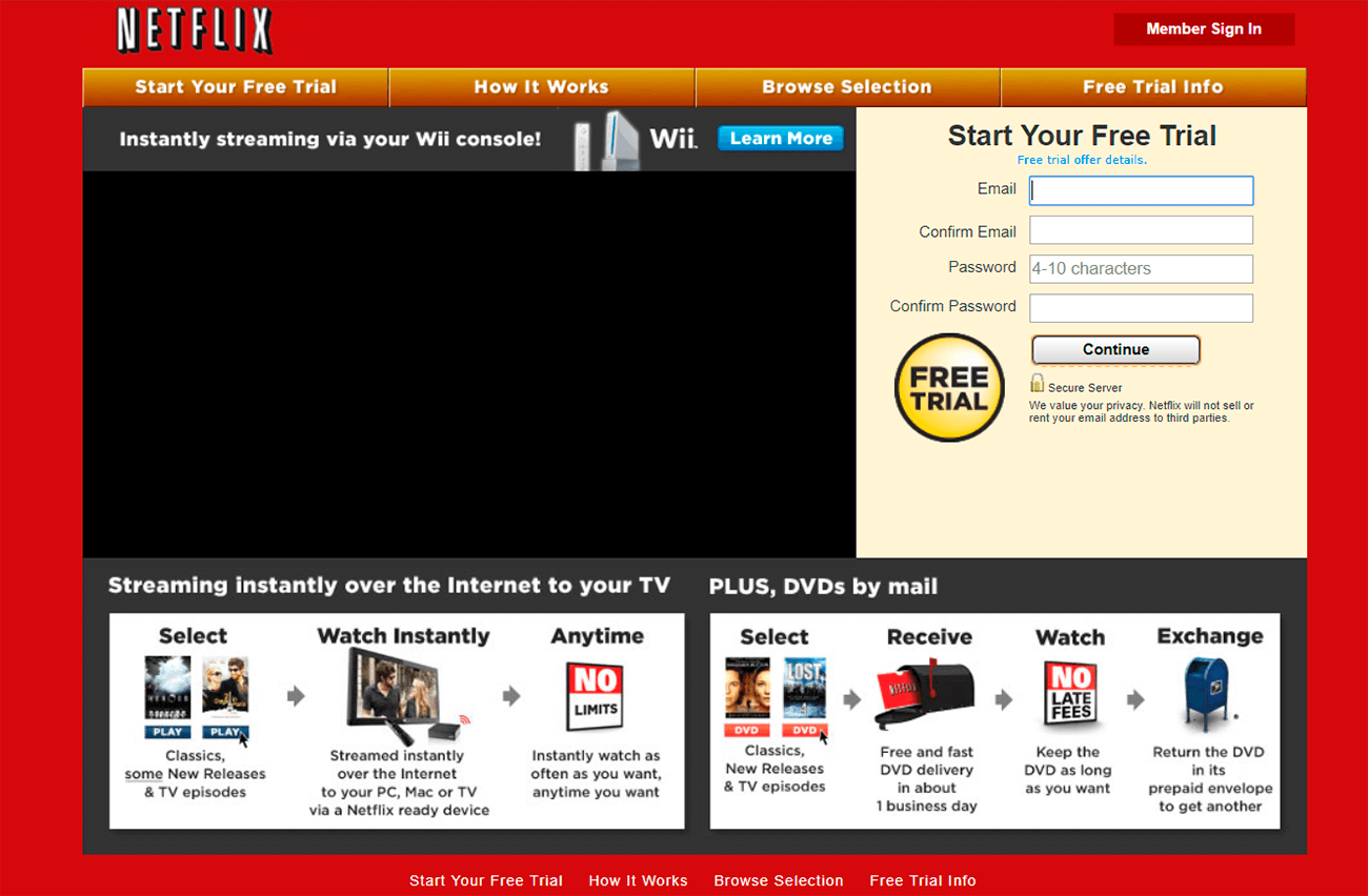
Just take a look at what Netflix’s homepage in 2010 looked like.
And now look at Netflix’s homepage just three years later.
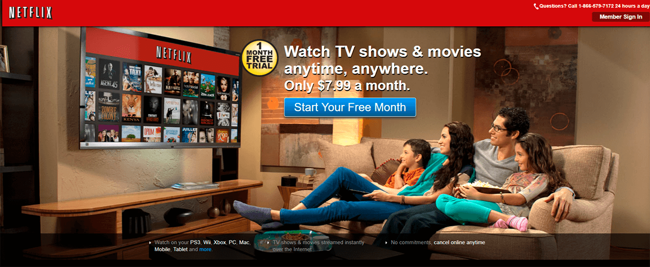
Netflix in 2013 looks much more like a landing page from now than the 2010 version. It was around this time that businesses began utilizing the benefits of landing pages, namely by using a sparse amount of links and focusing on giving a consumer something for their benefit.
For Netflix, their call to action (and the benefit they offered) involved an offer of a one-month free trial. It was and still is about getting people to click that blue “Start Your Free Month” button (or your business’s version of it).
There are two kinds of landing pages to be aware of: lead generation and click-through landing pages. The main difference between them is in how they convert leads. Still, both types of landing pages are different than homepages.
Though they’re often mixed up and overlapped, a landing page is not the same thing as a homepage. They can be quite similar except for some notable differences, one of them being the purpose.
A landing page is created specifically to convert those people who clicked on your ad (for example, your Google or Facebook ad). On the other hand, homepages are often meant to hold information about your business and provide a starting place for someone browsing your website. Homepages tend to be clicked on organically.
Landing pages are much more compact, containing ideally only one call-to-action button and often a template prompting visitors to provide their contact information. Homepages can have as many links as needed since the main goal is to give people who click on it the information they need about the business they’re looking into.
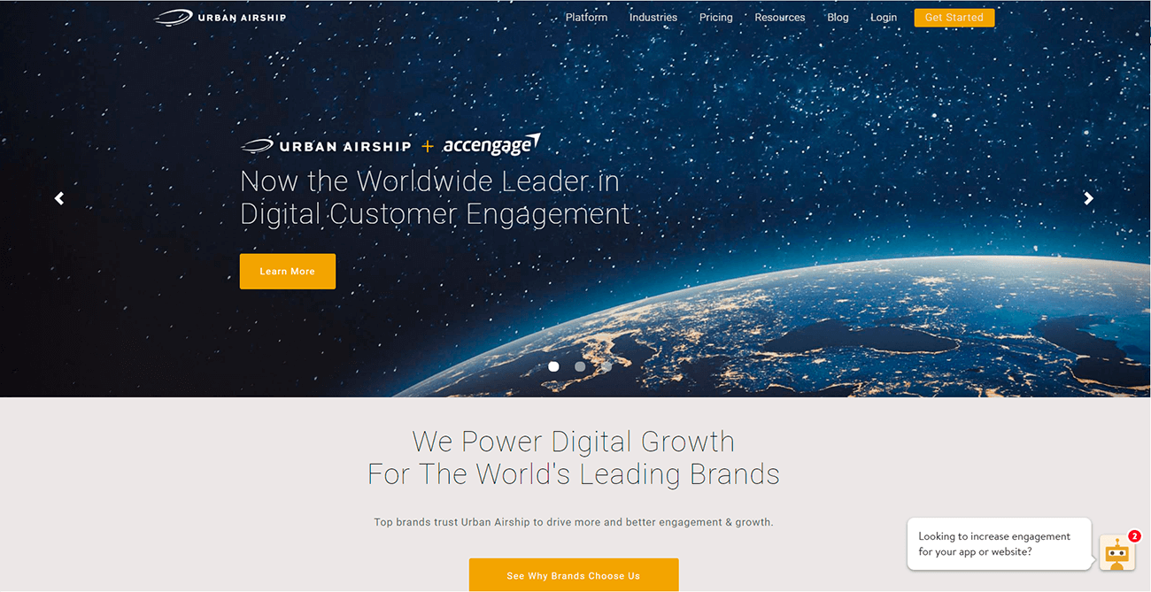
So while a homepage looks like this:
A landing page looks like this:
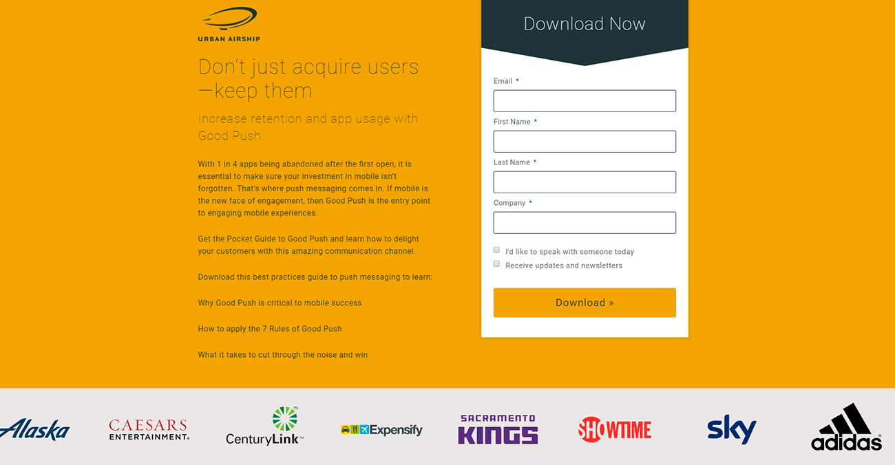
Notice how Urban Airship’s homepage and landing page look completely different. It has a menu at the top right and several links to other pages. There’s no form to fill out or any one call-to-action button.
Their landing page, on the other hand, has only one link (the call-to-action) and a form to fill out. It attempts to build our trust through listing brands that use them at the bottom (known as social proof). The page is short, no scrolling needed.
Landing pages should be used for marketing campaigns as part of, as mentioned earlier, a pay-per-click campaign. When someone clicks on your ad, they’ll be taken to the landing page where you’ll have to do the last sprint in convincing them to convert. Landing pages are useful for email campaigns when promoting a new product or an event, or to bring attention to special deals.
Lead Generation vs Click-Through Landing Pages
Let’s talk a bit more about the difference between lead generation and click-through landing pages. So far, we’ve mostly covered lead generation pages (as in the example above). Lead generation pages are good for businesses that want to build an email list or something similar. Click-through landing pages are mostly meant for businesses with a product to sell.
The main difference between lead generation and click-through landing pages is the purpose. Many of the other elements remain the same. Lead generation pages, however, are trying to convert leads by collecting their information (for example, collecting email addresses for an email campaign). Typically, how it goes is you offer them something (a service, discount, or content) in exchange for their information.
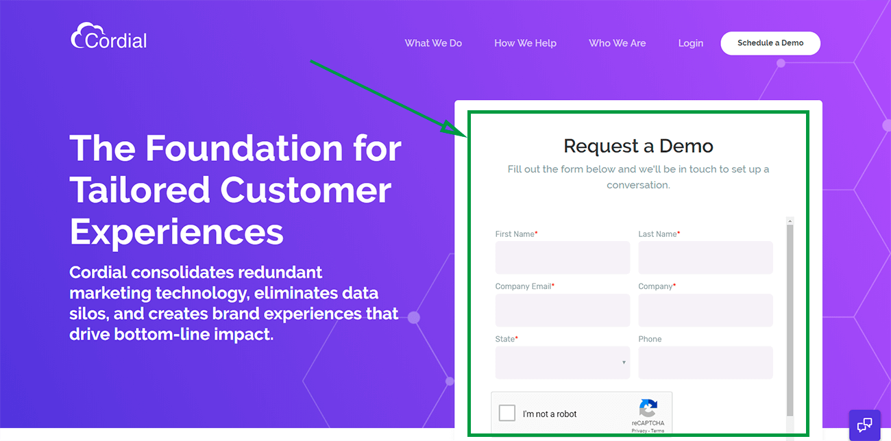
Cordial’s landing page is a good example of a lead generation page. Its main purpose is to collect information. It promises a free demo and a conversation.
Click-through landing pages work well for e-commerce businesses. They are meant to soften a visitor towards your product. It’s about convincing your visitor to buy before you lead them to a new page to check out for the product.
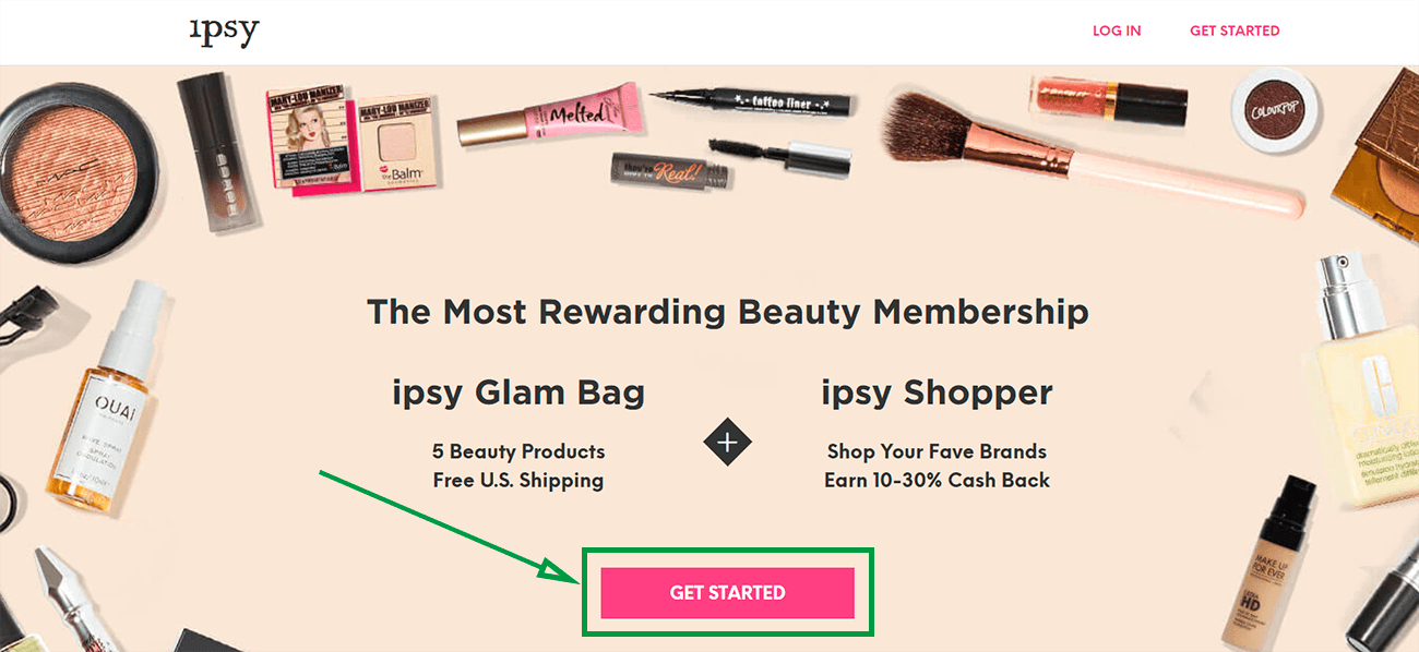
Below is a good example of a click-through page. The goal is not to collect information. Instead, it’s meant to warn you about the incoming request to purchase an “ipsy” subscription. If you press the “Get Started” call-to-action button, it’ll take you to another webpage to begin creating a personalized beauty profile.
Tips on How to Build an Effective Landing Page
So now that we’ve cleared up what exactly landing pages are, let’s talk about some techniques for building one.
#1: Keep it Simple
As mentioned earlier, simplicity is key when it comes to designing a landing page. In actuality, KISS (keep it simple and straightforward) is a good concept to keep in mind for marketing in general. Overwhelming your consumer is never a good way to go. Too much information or too many choices can cause consumers to forget their intent to purchase entirely.
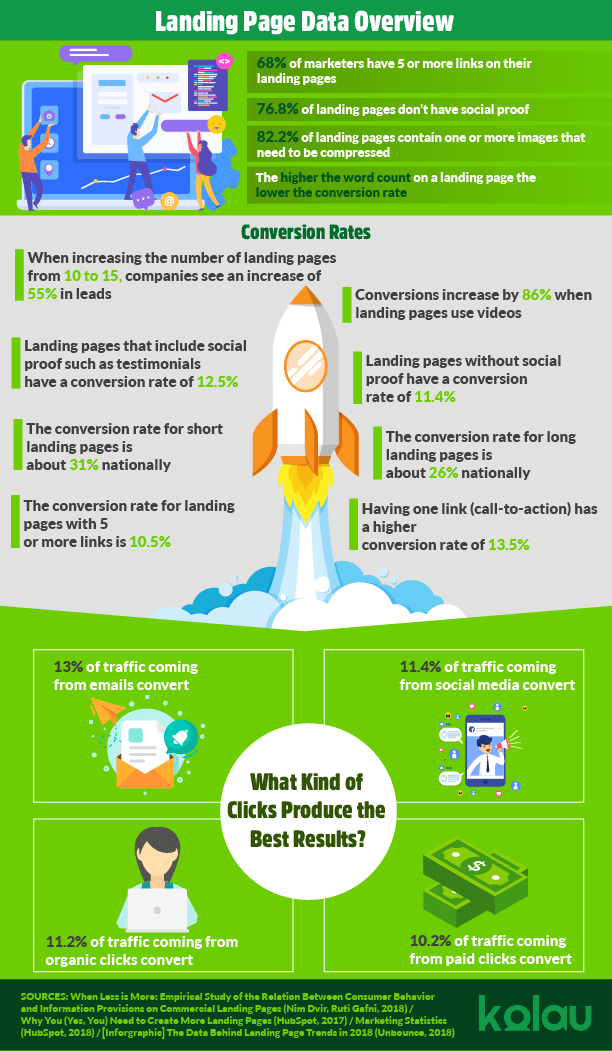
Unbounce’s 2018 study on landing pages found that 68.2% of landing pages contained five or more links. The same study found that having only one link was the most effective with a 13.5% conversion rate. In fact, the more links there were on a landing page the more the conversion rate decreased. Landing pages with five or more links had a conversion rate of 10.5%.
Too many links on a landing page are distracting and overwhelming. Psychologist Barry Schwartz wrote a book titled The Paradox of Choice, in which he suggests that too many choices lead to indecision, regret, and dissatisfaction. So, it’s no wonder too much information or too many choices lead to losing a sale. In a world full of endless decision-making, try to make this one as easy and straightforward as possible.
You want to have one call-to-action link and you want to make it very easy to find. Make it stand out. Make sure it doesn’t blend into the background and that the words you’re using aren’t bland or cliched.
Specificity is key for call-to-action buttons. Make it as particular to your business or product as possible. Creating a sense of urgency when the attempt is to sell something (instead of gathering customer information) is effective too.
For example, using words like “Sale – limited time” grabs attention. FOMO (fear of missing out) is a psychological phenomenon most people are familiar with. It’s the feeling you get when you’re forced to stay home while your friends go out and have fun or the feeling of watching your Facebook friends travel the world or go to parties. Creating a sense of urgency utilizes this fear of missing out.
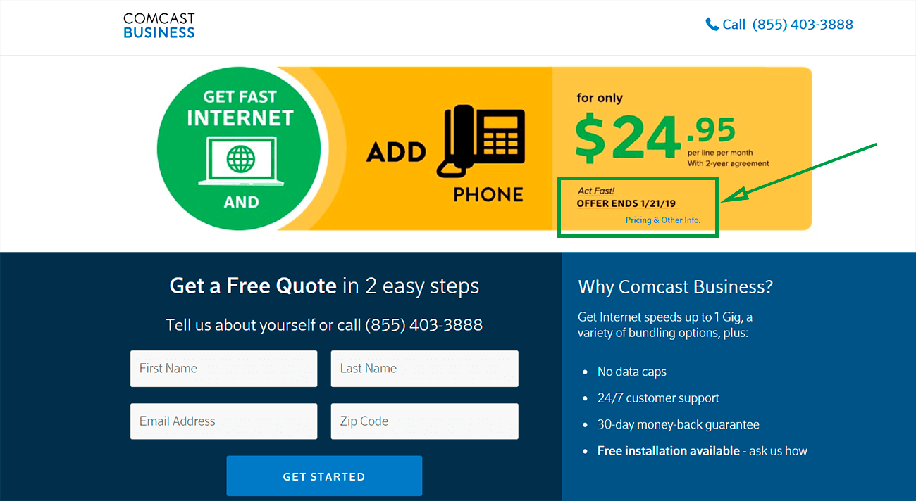
Comcast’s landing page promises a phone deal and emphasizes “Act Fast! Offer Ends 1/21/19” in order to encourage visitors to decide quickly lest they lose their chance. If someone is already considering signing up (and chances are, if they clicked on your ad, they are), the sense of urgency may help them make up their mind faster.
Not only do you want your call-to-action link to be obvious, but you also want to make sure your page is clean and simple. Comcast’s page is a little busy. A better example of a clean page would be Urban Airship’s landing page, mentioned earlier.
If it’s too busy, you’ll distract from your call-to-action link or frustrate your visitor. Remember: the purpose of a landing page is not to provide as much information as you can. It’s to provide just enough information to make your visitor interested. Don’t be afraid of white space.
Instead, think of it as your friend. Don’t make your page look bare but a good amount of white space is a step in the right direction. In their study about hotel landing page optimization, Renata Bitkulova from Saima University of Applied Sciences says,
The more whitespace is around the element, the more noticeable it becomes
Utilizing white space in fonts is also a good idea. Bitkulova claims that increasing font size and space between lines can “dramatically increase website conversion rate.” Make your page as easy to understand and navigate as possible. If a visitor can’t read your text, they aren’t going to stay on your website long. If they can’t easily find your call-to-action link, they won’t click on it. So a clean, uncluttered page is a must.
Too many words can also negatively impact your conversion rate. Bitkulova says a page should not have more than 200 words. More than that and you risk visitors losing interest and clicking out. Don’t use difficult words or terms either. It’s important your visitors can absorb and remember what information you do include on your landing page.
You should also try to keep your page somewhat short. A study called “When Less Is More: Empirical Study of the Relation Between Consumer Behavior and Information Provision On Commercial Landing Pages” discusses how shorter web pages nationally (in the U.S) have a higher conversion rate than longer ones. This data reflects the importance of making your landing pages simple. There’s no need for an excess of information.
Another thing to keep in mind is the resolution of your images. You want them to be good quality but you don’t want them to be big enough to slow down the loading speed of your website. Page load time can have a huge impact on conversion rate. If the loading time exceeds three seconds, visitors will likely give up and leave. The same is true for mobile traffic.
Also, don’t forget to consider what your page will look like on the most popular desktop display resolutions. According to StatCounter, the most popular sizes are 1366 x 768 and 1920 x 1080.
Consider the “fold area.” The fold refers to the area viewable when you first click onto a page without scrolling. There are some important things that should be kept above the fold regardless of display resolution size.
The call-to-action button should be visible above the fold as well as any important information and the template visitors would use to input their name and email. If your page does require scrolling, you can include another call-to-action button at the bottom but your only call-to-action button should not be at the bottom.
#2: The More Landing Pages the Better
To make your marketing campaign as effective as possible, you need to have several (more than 10) landing pages on your website. A report done by Hubspot found that when businesses increase their number of landing pages from ten to fifteen, their amount of leads increase by 55%. Any less than that didn’t have much effect.
You want to create more opportunities by targeting more people and increasing your number of landing pages helps achieve that. With more landing pages, there’s a higher chance of someone coming across one that is particular to their needs. You can provide more offers without cluttering one landing page. If one landing page doesn’t have an offer your visitor is interested in, chances are another one will.
When targeting, you should try to be specific. Don’t think about what a group of people might want but what one person might want. If you go too broad, you’ll lose the unique thing you have to offer and miss people who might have been interested in it. That doesn’t mean you can only target one kind of individual. Another landing page can be tweaked to target another kind of individual.
#3: Simple, Honest Headlines
As you probably guessed, it’s important to make your headlines stand out. Using bigger font and/or a different color (than the rest of your text) is a good way of achieving this.

This headline stands out because of its size and color. Not only that, the usage of numbers catches our attention.
Always make sure the headline on your landing page matches the description and headline the ad or email link the click came from. It reassures your visitor they are in the right place and that you’re being honest about what you offered in the ad. If a visitor feels tricked, they won’t stay on the page. According to Bitkulova’s study, 8 out of 10 visitors only read the headline before deciding whether to stay or leave.
Though you don’t want your headline to be too general, using simple, easy-to-understand words will make your page more approachable. Bitkulova refers to another study that found headlines with eight words increase click-through rate and using (odd) numbers, the word “how”, offering information, and punctuation like colons, hyphens or exclamations make for a better headline.
You also need to make clear what you have to offer right off the bat. Writing a question that relates to a need your visitor might have or a promise of solving a problem of theirs is the best way to go. You want to emphasize what you can give them.
#4: Focus on what you have to offer
Every part of your messaging, not just your headline, should be about what you can offer them. Don’t assume the description of your product or service will be enough to convince them they need you. Instead, explicitly but concisely explain what problem you’ll solve or benefits you’ll give them.
If you want them to give you their contact information, you have to make it worth it on their end. What will they gain if they download your ebook? Are you offering them a discount for signing up with you? Or maybe a free trial? Is your service a solution to a problem? Well then, you need to tell them the solution you offer and a hint to why it works. It’s all about the potential client and their needs.
If you’re unclear about what they’ll get or if you withhold too much information about what you’re offering, your visitor will have no inclination to stay, let alone sign up. Make this an easy choice for them.
Knowing your audience is important when it comes to deciding how to market your business on your landing page. As I mentioned earlier, it’s good to have multiple landing pages to increase your chances and reach, but nonetheless, targeting works best when you’re envisioning a particular person’s needs instead of thinking of archetypes or groups of people.
#5: Hero Images and Videos
A hero shot, in the words of Bitkulova, is an image or video demonstrating how a product is used. It’s meant to trigger an emotional response and/or help the visitor imagine themselves using the product.
In their paper, Bitkulova lists various types of “hero shots,” including what’s called the happy user, the product shot, and the explanation video. The happy user shot is probably exactly what you imagine it to be. It’s a photo of someone happily using your product or service.
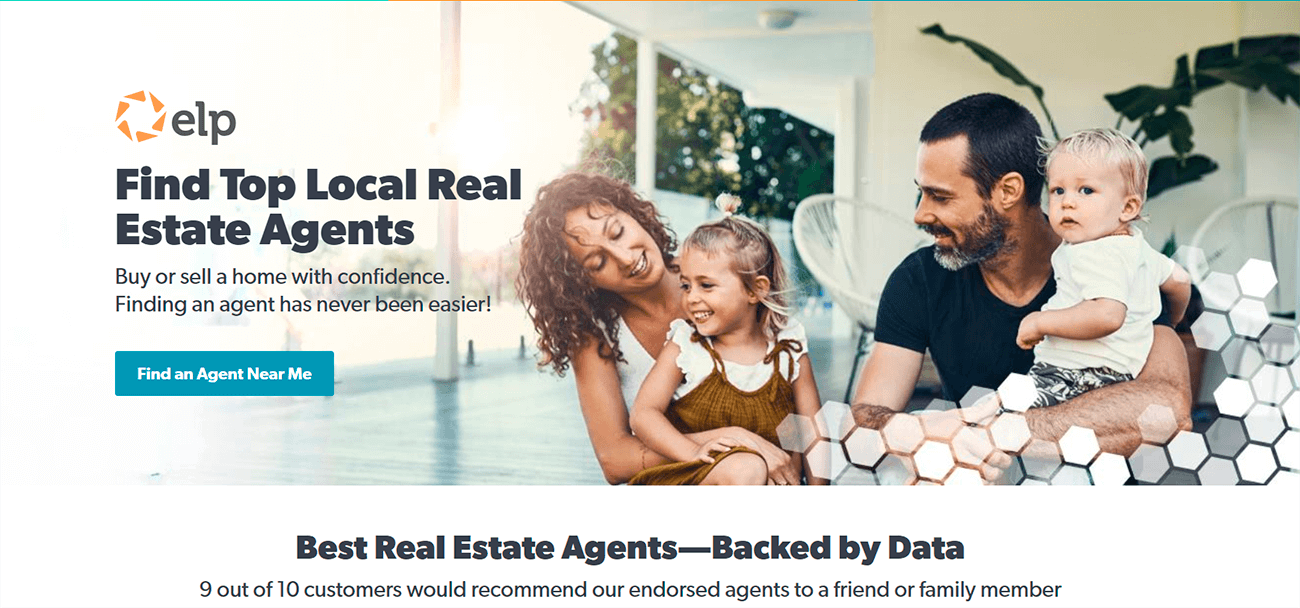
This image of a happy family is a good example of a happy user(s). They’re smiling and the image is interesting though not busy enough to distract us from the blue “Find an Agent Near Me” button next to them. Picking a family image is a good choice for a real estate marketing strategy, especially if they’re targeting families. The more relevant the imagery, the more realistic it’ll feel for your business. https://www.kolau.com/marketing/real-estate-marketing
A product shot is used to emphasize what the visitor will receive if they convert. The image is just a photo of what the product looks like and is usually accompanied by a description of the product and how it works.
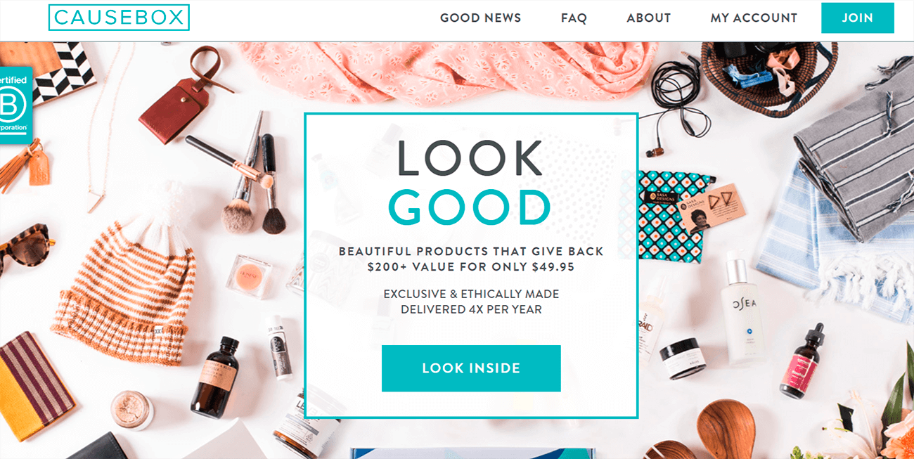
Very similar to the “ipsy” screenshot, CAUSEBOX’s landing page uses a picture of beauty products and accessories instead of pictures of people. Because both “ipsy” and CAUSEBOX are beauty subscription boxes, it makes sense to focus on the products a customer may receive as opposed to implying their satisfaction with a service (like with the real estate example).
Videos can be very effective. You can use videos to explain your product without having to take up extra space on your landing page. Videos shouldn’t be long (2.7 minutes or less, in fact, according to Bitkulova). Use video to tell your visitor how your product works or how it’ll benefit them or use it as a testimonial.
An essay by Robert Ejupi exploring social media trends found that videos and images create more engagement than text. 48% of Ejupi’s respondents preferred content that included video and/or images (the highest percentage of the study). 11% of respondents said they preferred content in plain text. It would be to your benefit to include one or both as part of your landing page.
#6: Build Trust by Showing your Credibility
Matching your headline with your ad is one way to create trust between you and your visitor and social proof is another way. Looking at Unbounce’s study mentioned earlier, you can see the conversion rate for landing pages that include social proof, such as testimonials, case studies, press mentions or usage statistics is higher than pages without any social proof.
Including as much social proof as you can clutter your landing page a bit too much so it’s best to stick with a few things. Testimonials work great as long as you include photos of the person and full names. People are less inclined to believe someone is real with little information about them.
The testimonials should be specific as well. Broad praise like “good service” means almost nothing. It’s much more believable when the praise talks about the specific benefits or services the person received or the results your product achieved for them.
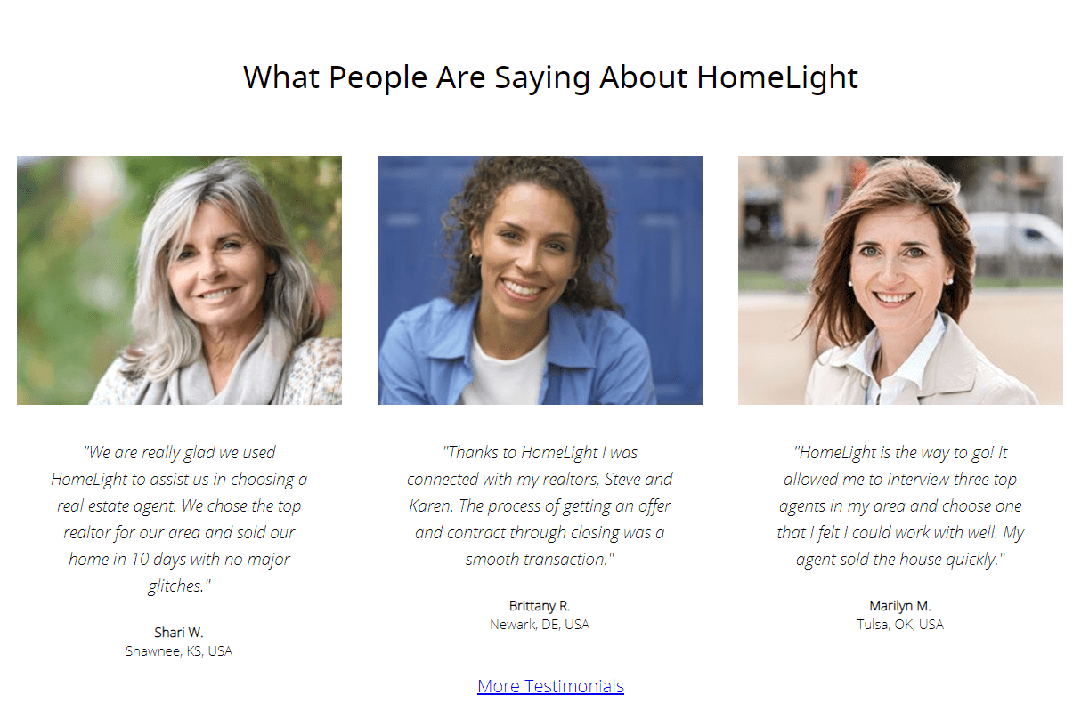
This screenshot is taken from HomeLight’s landing page. It does take a second to find the testimonials (ideally it should be more obvious), but the way the testimonials are written is well done.
Though we’re not told the women’s full names, we can see their location which makes them somewhat more believable. Their testimonials are detailed and use names and numbers. For example, Shari tells us she sold her home in ten days and Marilyn tells us she interviewed three top agents in her area.
Press mentions and trust seals make your page look more trustworthy as well. If you can prove media outlets are talking about you by showcasing your press mentions, you look legitimate and it makes your product or service look useful.
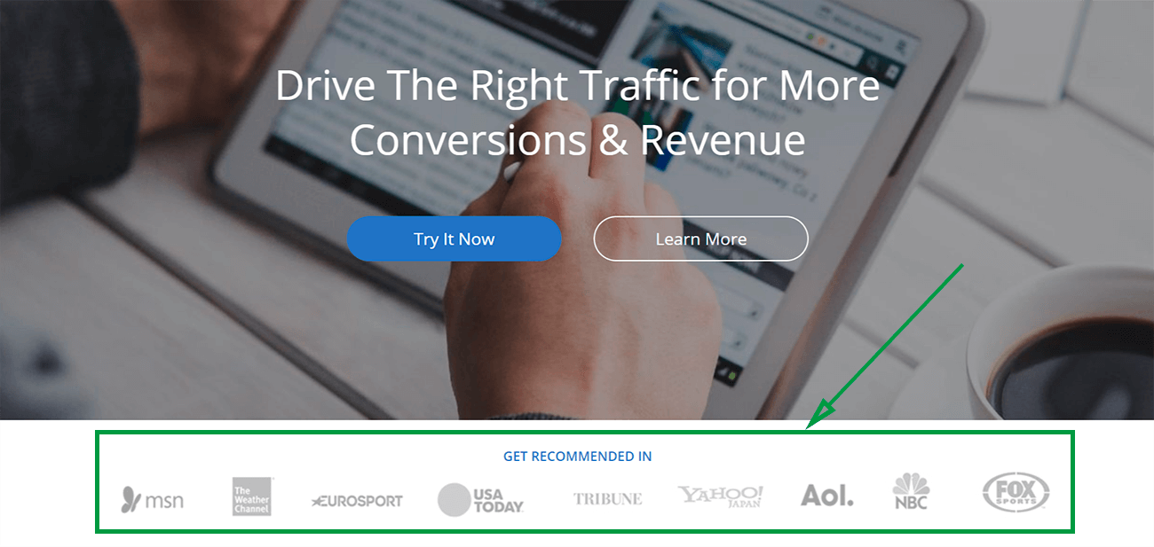
Underneath Taboola’s call-to-action links, they list the news platforms they have been featured in, making themselves look much more credible.
Remember that gaining trust is about being real. A stock image of a smiling person, even as your hero image, will not yield you the same results as if you used a photo of a real person with their real name.
Another thing that will build trust in your landing page, especially if you’re asking for contact information, is making sure you have the “secure connection” icon at the top left corner next to your webpage URL.
People want to know that their information won’t be stolen or misused if they hand it over.
Including a phone number somewhere obvious on the webpage also increases trust, according to Bitkulova. It reminds visitors there are real people on the other side.
#7: Make a Landing Page that’s Mobile-Friendly
People use their phones to scroll through the internet and find information more and more. Before October of 2018, mobile usage surpassed desktop usage. Though, as of November, the desktop has once again overtaken mobile usage, they’re constantly at a head to head. This is why it’s more and more important to make sure your landing page loads quickly on mobile and looks good.
What does someone who arrives on your page through phone see without having to scroll? What do the photos you chose look like?
Because mobile can require very different things than desktop, it makes sense to create a landing page just for mobile users. Make your headlines shorter so they fit on a mobile screen. Make sure your information-collecting template fits the screen without scrolling and make it easy to input. Things are smaller on a screen and if you have a long template, it’s not going to work well for you, especially on mobile.
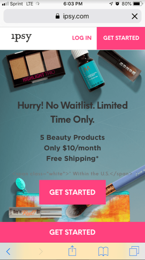
If you remember what “ipsy’s” normal landing page looks like, you’ll notice how different their mobile landing page looks. Their call-to-action links remain above the fold and the picture is much smaller than the one for their desktop version.
One huge advantage of mobile landing pages is the ability to include a “tap to call” feature. Mobile makes it incredibly easy for visitors to give you a call. They won’t have to memorize or type your number. They can be immediately put in contact with you.
Don’t Forget to Test
A/B testing refers to when you compare a page against another page (or series of pages) with only one major difference. For example, you can put the information template on the right side in one version and on the left side in the other version. Or you might change a word in the headline. Testing these pages against each other helps you decide which one is working better.
Testing is the best way to see what is actually working.
If you’re interested in learning how to convince people to click on your ad in the first place, check out our article on How to Create Effective Google Display Ads. Better ads lead to more clicks and more people checking out your landing page!


