[COVID-19] To help mitigate COVID’s impact on real estate agents, Kolau is waiving the fee to create a FORBES™ Award-Winning website with e-commerce enabled.
Create your website quickly and easily clicking here – Offer available for a limited time only.
Real estate is a profession rooted in the real world. It’s not something that can be done 100% over the internet and closing a deal isn’t as easy as clicking a button and putting in your credit card information.
Most people want to see the space they’ll live in before they purchase. Despite all this, as a real estate agent, you need to be visible online and you need to know how to create an effective real estate landing page for your business.
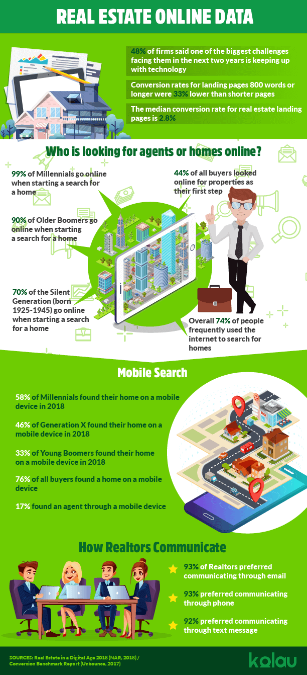
According to the National Association of Realtors, 74% of all buyers frequently searched online for homes and 93% of people used an online website during their search in total. So, as the numbers show, most of your potential clients exist on the internet.
While 86% of people used a real estate agent, only 17% contacted a real estate agent as their first step. That means people do want to speak to a real estate agent and getting leads online is one way to encourage those people to choose you and not your competitor.
One sure way to one-up your competitors is to have a landing page and a landing page that works. Because of the unique nature of the real estate business, it can be hard to make an effective landing page that does what you need. After all, your goal isn’t to sell a product online in the traditional sense nor is it to get people to sign up for a service.
What exactly are landing pages?
If you’re confused about what a landing page is, don’t worry. You are not the only one. Many people think of landing pages and homepages interchangeably. Though some people use homepages as they would a landing page (for example, they link their homepage to an ad), this is perhaps not the best practice.
In fact, landing pages aren’t the same as homepages. Homepages are meant for exploration and are often there to provide information for visitors. Landing pages only have one purpose: to get a conversion.
Whether it’s to convince people to sign up to your mailing list or inquire about a listing, a landing page’s job is to get visitors to click on that call-to-action button. You’re paying for the click and you want to make it count.
So, for example, this is the homepage for FoundValencia.com:
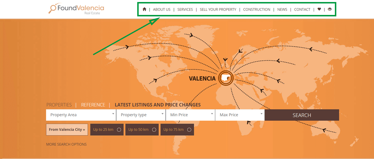
Notice the menu at the top, showing several links for those who want to find more information. If you were to scroll down on this homepage, you would see several videos, links to property listings, and much more.
Now, this is what one of their landing pages looks like:
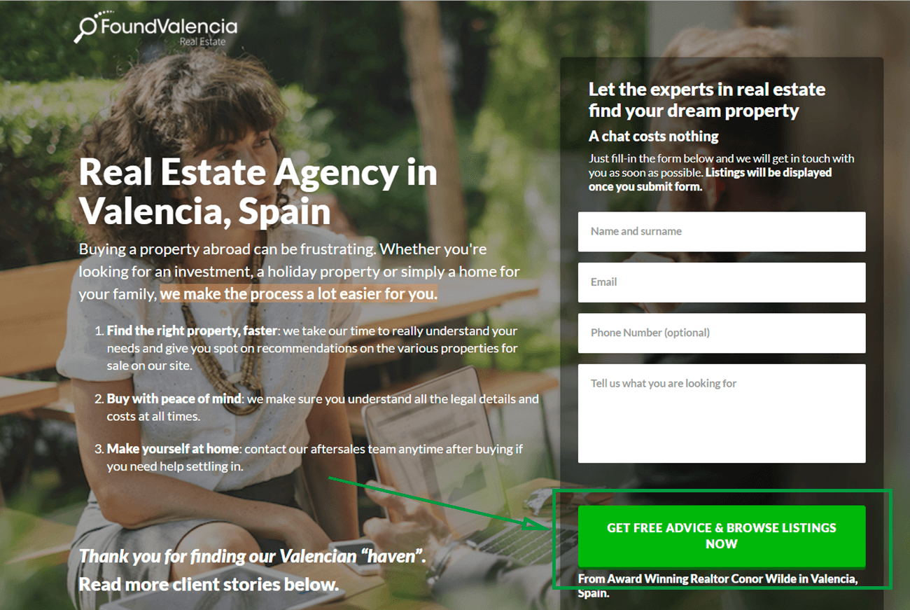
See the difference? There is only one link: the call-to-action button. If you scroll down, you’ll see a much shorter page than the homepage consisting of photos and a “Why Choose Us” section, but there are no other links besides the one at the top. The main goal of this page is to convince visitors to input their information in the form and press that “Get Free Advice & Browse Listings Now” button.
One thing that will not change, regardless of what type of real estate agent you are, is the best way to design a landing page. The most important thing is to keep your landing pages simple.
Though it can be tempting to include as much information about what services you provide or the type of homes you sell, a crowded landing page won’t get you those conversion numbers you’re looking for.
Conversion rates for landing pages longer than 800 words were 33% lower than those for shorter pages.
Short pages are more likely to straightforward and not distracting.
A lot of factors go into the logic of simplicity, including the psychology around being overwhelmed by too many choices. It holds true for landing pages, especially. There’s only one goal (conversion), so don’t distract your visitors from it.
Types of Landing Pages for Real Estate
You can go in many different directions when creating your landing page and, of course, that’s influenced by your target group. Here are some ways you can use a landing page and who they will attract.
Home Value Landing Page
Home value landing pages offer to tell sellers how much their home is worth. These kinds of landing pages are good for propelling people into action. If you want to catch people at the beginning, this could be a good way to go. One of the first things people will need to know is how much their home might sell for.
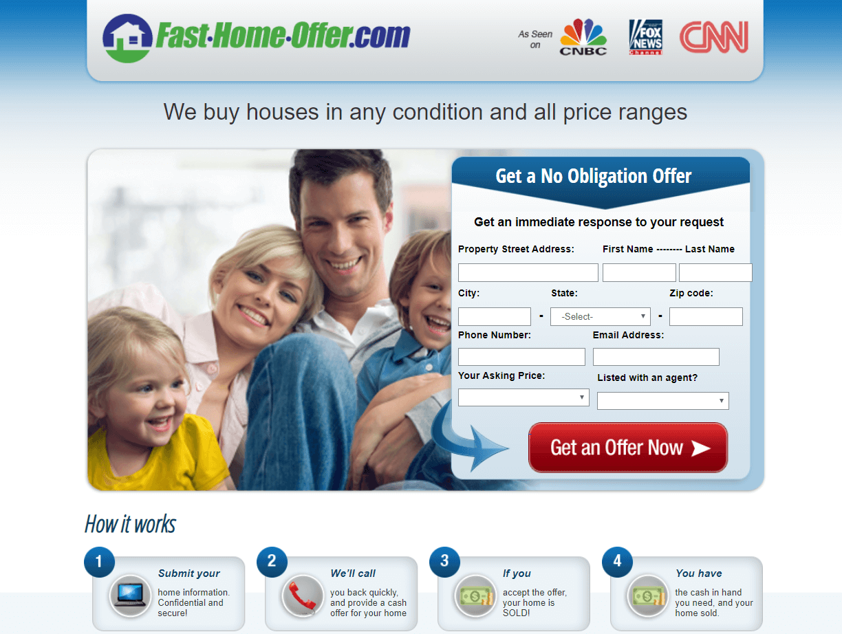
The example above is pretty straightforward, which is exactly what we want. There’s no point of exits, the call-to-action button is obvious and easy to click on. It’s better to have fewer form requirements than the number featured here, but it makes sense they would ask for an address as well as email and phone number. According to BluLeadz, the average number of form fields is eleven, but shortening the number to four can increase conversion rates.
Because this business is offering more than just a price value (but also to purchase from them), it could afford to have a bit more social proof. The “As Seen On” section improves trustworthiness to some degree, but testimonials or reviews would help this page a bit more.
Home Search Landing Page
If your target group is buyers, not sellers, a popular and effective way of attracting attention from them is using a home search landing page. This works especially well if you have multiple listings to show.
Still, you shouldn’t use your listing page as your landing page. You should give them the option of clicking a call-to-action button to proceed to a listing page. The goal is to convert, which is less likely to happen the more distractions there are on a page and without a clear call-to-action button.
The example below is from a Landingi template and shows us exactly what a landing page, even one for a home search, should look like.
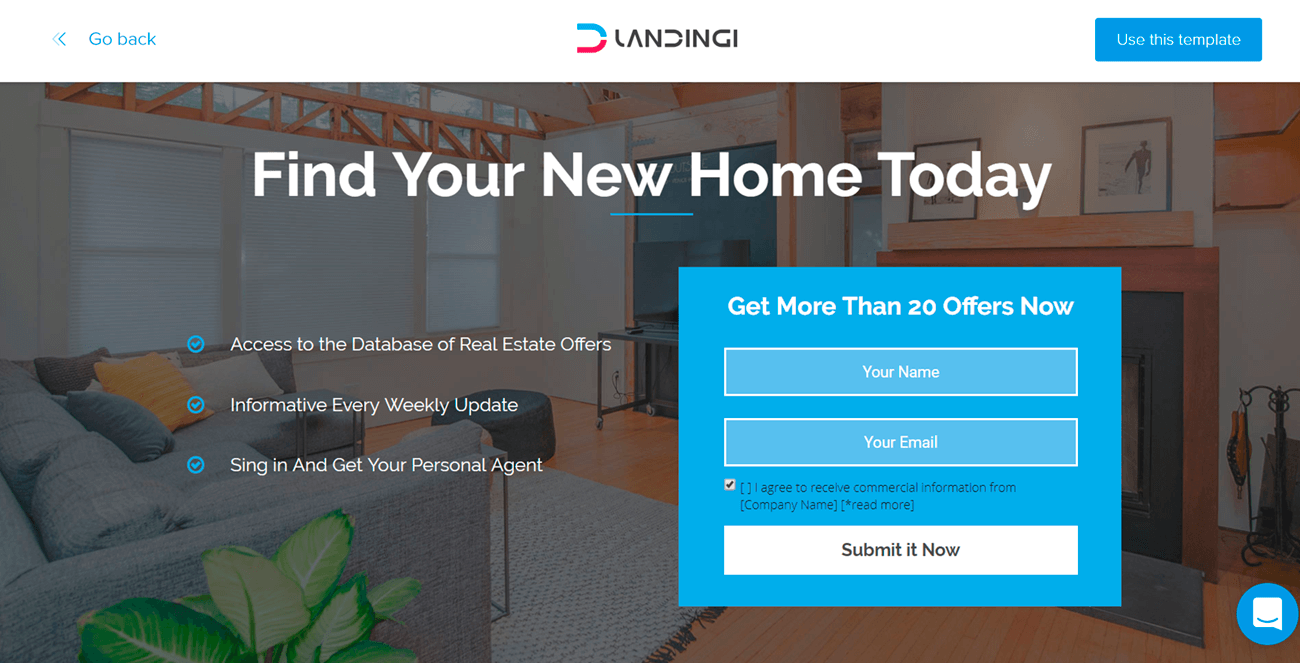
Source: Landingi.com
The page doesn’t show us the listings. Instead, the visitor is required to input their information in order to view the “real estate offers.” Because this is a template, the language used is intentionally vague. When creating your landing page, specificity is a good thing.
For example, instead of the offers listed in the image above, you could offer something like “access to 100+ San Diego, CA family home listings.” For the second offer, you might say something like “be the first to see new homes on the market.”
Agent Search Landing Page
Agent Search real estate landing pages work best for real estate companies, not individuals. In fact, they’re usually hosted by bigger real estate companies, but that doesn’t mean that if your company is a smaller real estate firm you can’t put this type of landing page to good use.
If you have enough real estate agents working with your company, you can ask a short series of questions (which you can control the answers to) like in the example below to match your visitor up with one or more agents.
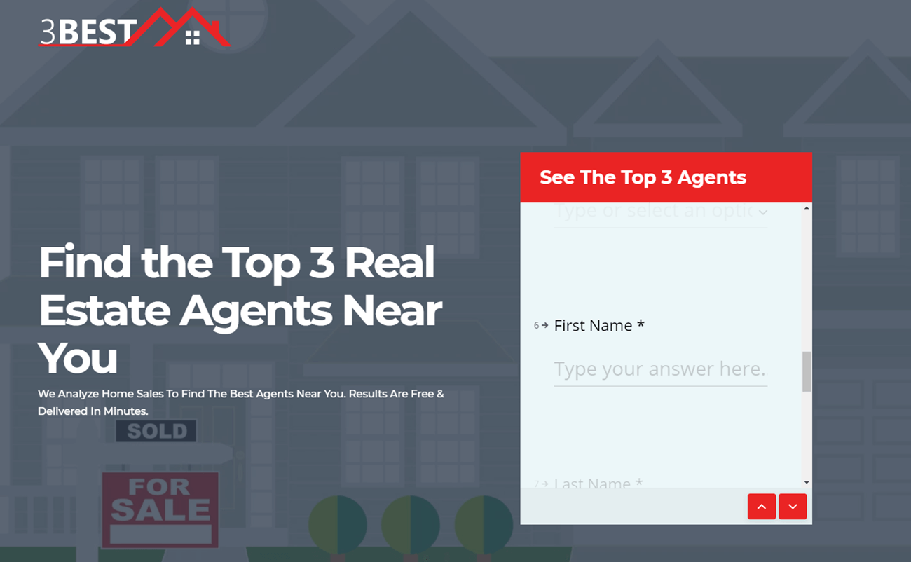
3 Best’s information-gathering form is a bit long with nine questions and a scrollable form. The call-to-action button isn’t visible until you scroll to the bottom of the form, where a button in red prompts you to “See The 3 Best Agents.”
The landing page is somewhat long, but it spends the space working on building trust through explanations of how it works. It also emphasizes it’s value in being “Free and Unbiased,” explaining where their honesty comes from.
The page doesn’t need to explain itself as much as it does. Brief, one or two-second explanations for their “How We Rank Agents” section would make the section more digestible.
However, there’s no way to leave the page without clicking on the call-to-action button. The headline and subheadline do a great job of attracting attention and explaining concisely why the visitor should use their service.
Free Content Landing Page
This kind of landing page offers content in exchange for (usually) information. For example, you could offer a free buyer’s guide in exchange for their contact information. This works well when people are doing research and trying to get started on their home-buying or selling process.
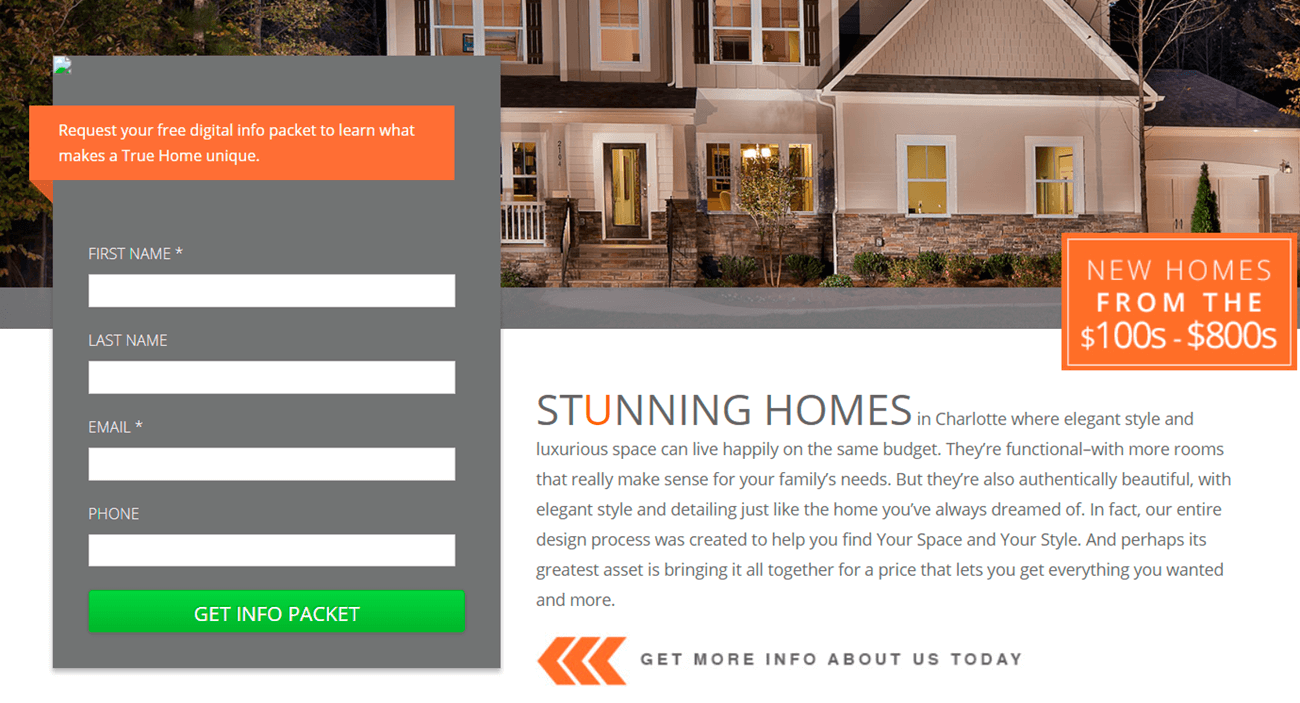
Though the landing page can afford to be a little clearer as to what the info packet will include, the above is an example of a free content landing page. As you can see, they offer an info packet that helps visitors learn “what makes a True Home unique” in exchange for contact information.
Though, as I mentioned earlier, it’s best to be very clear about what visitors will gain from your free content. This webpage focuses a bit too much on themselves. The info packet should be promising visitors information they would find valuable, not more information on why they should want to use True Homes.
Listing Agents Landing Pages vs Buyer’s Agents Landing Pages
Depending on what kind of agent you are, your goals and the target audience for your landing page will be different. Your potential clients might not know the difference between certain types of real estate agents. They might not know the terms “listing agent” or “buyer’s agent” at all.
Think about how early in a potential client’s search you want to appear. For example, if someone is searching “agents who sell homes” or “who can help me buy a home,” do you want your ads to appear? After doing some information gathering, it’s likely someone will figure out the terminology on their own, but do you want to wait that long to reach them?
Listing Agents Landing Pages
As a listing agent, you target people who want to sell their home. You don’t want to accidentally attract people looking to buy a home, which can happen easily considering how similar search terms can be for selling and buying a home. In your ad and in the title of your landing page, you want to make absolutely clear visitors know you’re there to help them sell their home.
You can design your landing page around helping people find the right listing agent, convincing them to submit their contact information so you can contact them, or offering them a free service.
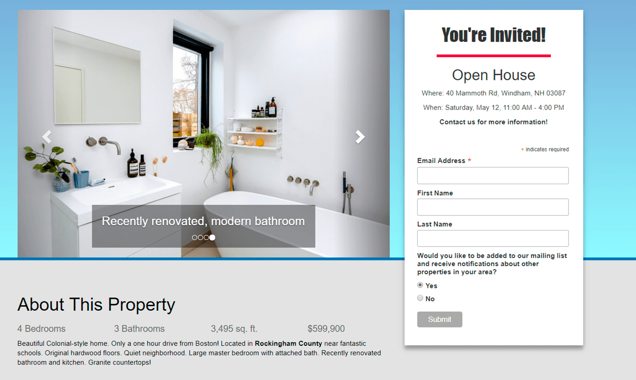
However, once you’ve found a client, you can help them sell their property through single-property landing pages or open house landing pages. Below is a demonstration of an open house landing page from RealToDo.
Source: RealToDo.com
This is a great example of a landing page. It has all the information someone might need (home details, address, time and date, and price) without overwhelming the visitor. The choice to have a slideshow of photos featuring the best parts of the home further piques the visitor’s interest.
There are only three form sections, only one of which is required, and a casual option to become part of the company’s mailing list. It emphasizes the choice on the part of the visitor.
Buyer’s Agents Landing Pages
As a buyer’s agent, it’s your goal to find people who are looking to buy a home. Because many people don’t know that listing agents don’t necessarily also help you buy a home, it may be harder to find people searching for “buyer’s agents.” Instead, you could create an ad and landing page for listings.
People looking to buy are likely to search something along the lines of “2 bedroom house in Washington,” for example. That doesn’t mean you can’t have a landing page related to the search “buyer’s agent.” For example, the landing page below does a good job of convincing its visitors to connect with a real estate agent.
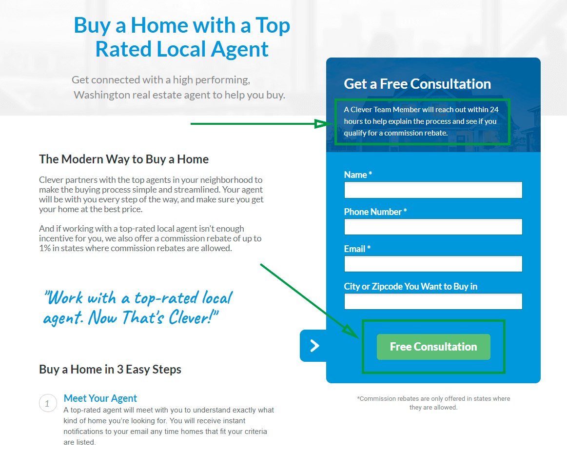
Clever promises to connect you with a top agent who will make sure you get your home at the best price and, possibly, a commission rebate. If you scroll down just a bit, you’ll see the section for “Buy a Home in 3 Easy Steps.” The descriptions are only one to two sentences long, making them simple and easy to read. There’s only one call-to-action button.
If you scroll all the way to the bottom, you’ll see social proof such as a “Featured In” section and testimonials. The second button at the bottom takes you back up to the form at the top of the page. If your landing page has to be on the longer side, it’s a good idea to put a call-to-action button that does the same thing as the one at the top of the page at the bottom.
Working as both
If you work as both a listing agent and a buyer’s agent for different transactions, then you’ll need to make both kinds of landing pages. It’s normal (and encouraged) for you to make multiple landing pages for the sake of targeting multiple types of people.
Your conversion rates will go up if you have more than a certain number of landing pages. According to Hubspot’s Marketing Benchmark report, companies who increase their number of landing pages from ten to fifteen or more see a 55% increase in leads.
Tips and Tricks for Real Estate Landing Pages
The Basics of Designing Landing Pages
There are some things that are true regardless of what kind of landing page you’re creating and these are some of those things.
- Make sure your landing page isn’t too long. As mentioned earlier, longer pages get lower conversion rates than shorter pages. Landing pages are not homepages or listing pages. The goal is not to provide your visitors with as much information as possible, it’s to get them to click one button.
- Speaking of the button, it’s important to make your call-to-action button stand out the most amongst everything else on the page. That click is often that last step that needs to be taken before a visitor has officially converted. If you bury your call-to-action button under a lot of information or if the color of the button blends into the background or if it’s not above the fold (what you can see when the page loads without scrolling), you risk making it too difficult for your visitors to find. You can’t predict how much energy an individual person is willing to exert to find, not to mention click, your call-to-action button so it’s best to make it as effortless as possible.
- Keep message-matching in mind. This means that the message you promised in your ad (through your title and/or description) is fulfilled in your landing page. For example, if your ad promises to “Sell Your Home Faster and for More Money,” then your landing page title should say the same thing or at least a close variation of the same thing. If you don’t follow through on the promise you made in your ad, your visitor might feel cheated and immediately click out of your landing page.
- Take the loading time of your website into account when choosing your image. Don’t rely on a visitor’s patience. According to Renata Bitkulova from Saimaa University of Applied Sciences, almost half of users expect a website to load within two seconds and click out if the loading time exceeds three seconds.
- Consider making landing pages especially for mobile devices. According to the National Association of Realtors, 76% of all buyers found a home on a mobile device, meaning it’s beneficial to have a landing page at least accessible and functional on a mobile screen. Ideally, your mobile landing pages will be optimized for a mobile device (smaller photos, for example) and will be easy to navigate on a smaller screen. Mobile devices also make it easier to prompt your visitor to call you. So, if that’s your preferred method of communication, it would be a good idea to include a click-to-call link in your ad or on your landing page.
Here is an example of a landing page that does all of these things really well.
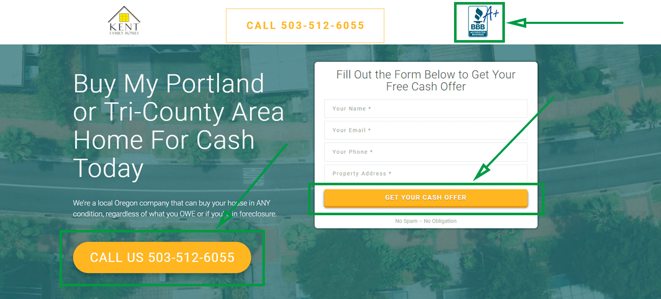
The page is mobile-friendly. The call-to-action button is bright yellow and the form is clear. The ad, which states, “We Buy OR Houses For Cash,” matches the headline on the landing page. They have social proof in the form of the Better Business Bureau logo. The page isn’t very long but you can scroll down and look testimonials.
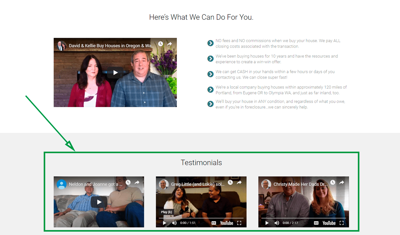
The testimonials are clearly real and natural. Their clients share bittersweet stories about how they ended up in their situation and heartwarming solutions. The only thing this page could work on is lowering its amount of links. The testimonials are great, but having a link for “More Testimonials” will only encourage visitors to hear more of those heartwarming stories instead of scrolling back up to input their information.
Preview Listings but Don’t Link to all your Listings
When advertising listings, it might be tempting to just link your listing page to your ad (and many real estate landing pages do this), but that defeats the purpose of a landing page. Doing this might keep people browsing but it likely won’t get you enough conversions to justify the click. Showing all your listings right off the bat does the complete opposite of keeping it simple and encourages your visitors to conduct the search on their own.
If you want to show some listings on a landing page, it would be a better idea just to preview a few. The trick is to give your visitors an idea of what kind of property you deal with and enough inclination to want to click that call-to-action button. It is very easy to get distracted by browsing through several listings, especially if someone is just beginning their search. It would be more effective to collect their contact information first before allowing them to become bored with your page and clicking out.
Show off your certifications
If you have some impressive certifications or awards, it’s not a bad idea to show them off on your landing page. At the very least, you have a real estate license, which is something you can include. Though not everyone will know what certain certifications mean, those who do will be glad to see things like Seller Representative Specialist or Certified Residential Specialist.
Not to mention, even though some visitors won’t know what they mean, you’ll still appear more knowledgeable and talented.
If you have certifications for particular kinds of movers, for example, the Military Relocation Professional (which indicates a specialty in assisting military personnel being relocated), people looking for these kinds of real estate agents will be glad to see the specialization.
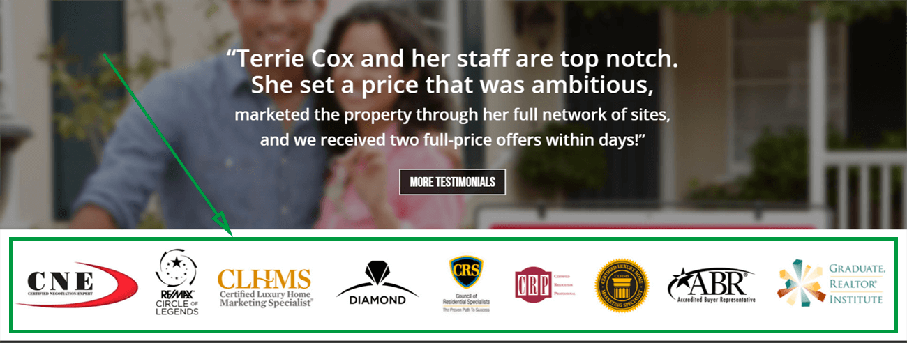
Terrie Cox makes the mistake of using her homepage as her landing page, but apart from that, she uses some great strategies on her page. For example, she shows off her certifications effectively, without words, and while taking up a reasonable amount of space.
Include a Brief Video Tour
According to Hubspot, videos are extremely effective when used correctly and can increase conversion rates by 86% when used on landing pages. Though, it’s best to keep them brief, less than 2.7 minutes, according to Bitkulova.
Consider including a video tour, maybe of multiple homes or of a neighborhood, in order to give an easy and digestible explanation as to why your visitor should use your business over someone else’s. No long descriptions are necessary!
The video is a little long, but it shows how easy it is to create a video tour. There’s no need to over-explain because the house is beautiful all on its own. The video does a good job of focusing on the details and showing the house in the best light through the camera movements.
Video tours satisfy the curiosity of visitors and reassure those on the fence about a home that inquiring about it is worth it.
Family Photos or Photos of Beautiful Homes
Consider correlating the photos on your landing page with your target group. Showing photos of beautiful homes (inside or out) or neighborhoods is a safe and effective choice. They tend to be less distracting but not uninteresting. However, if you’re selling to families, it wouldn’t hurt to show a picture of a happy family.
Just remember that photos that look very obviously like stock photos tend to reduce trust in your landing page, according to Nielsen Norman Group. Visitors also tend to ignore generic photos of people. If you choose to have a photo of a person or family, take one of a real family you helped or at least find one that looks and feels real. Making a photo feel real sometimes comes down to including names (like the last name of the family) or testimonials.
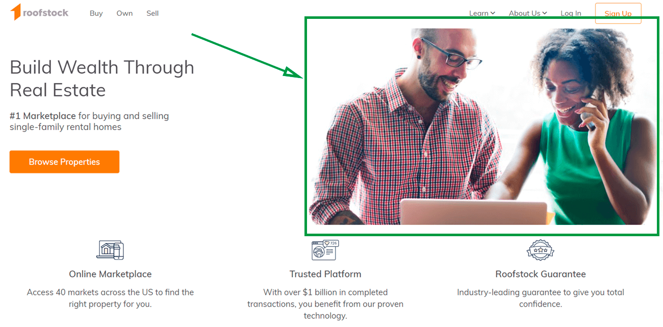
The above is a good example of what it means to have a picture look real. Their smiles look genuine and it’s quite obviously not an awkward stock photo. It appears as if they’ve been caught for a photo, not as if they’re posing for one.
Also, a good trick to keep in mind is picking a photo or aligning your call-to-action button so the person or people in the photo are looking in the direction of the button. It draws attention to the call-to-action, putting more emphasis on it.
Testimonials
Testimonials work great because they prove you get good results. According to Boast:
89% of B2B marketers consider testimonials the most effective marketing strategy
One reason for this is because people trust testimonials written by other consumers as much as recommendations from friends. Like photos, testimonials should be real and they should feel real. Including testimonials on your landing page without including any information about the people giving them, such as names or locations or photos, make them feel that much less credible.
Take a look at Effective Agent’s testimonials.
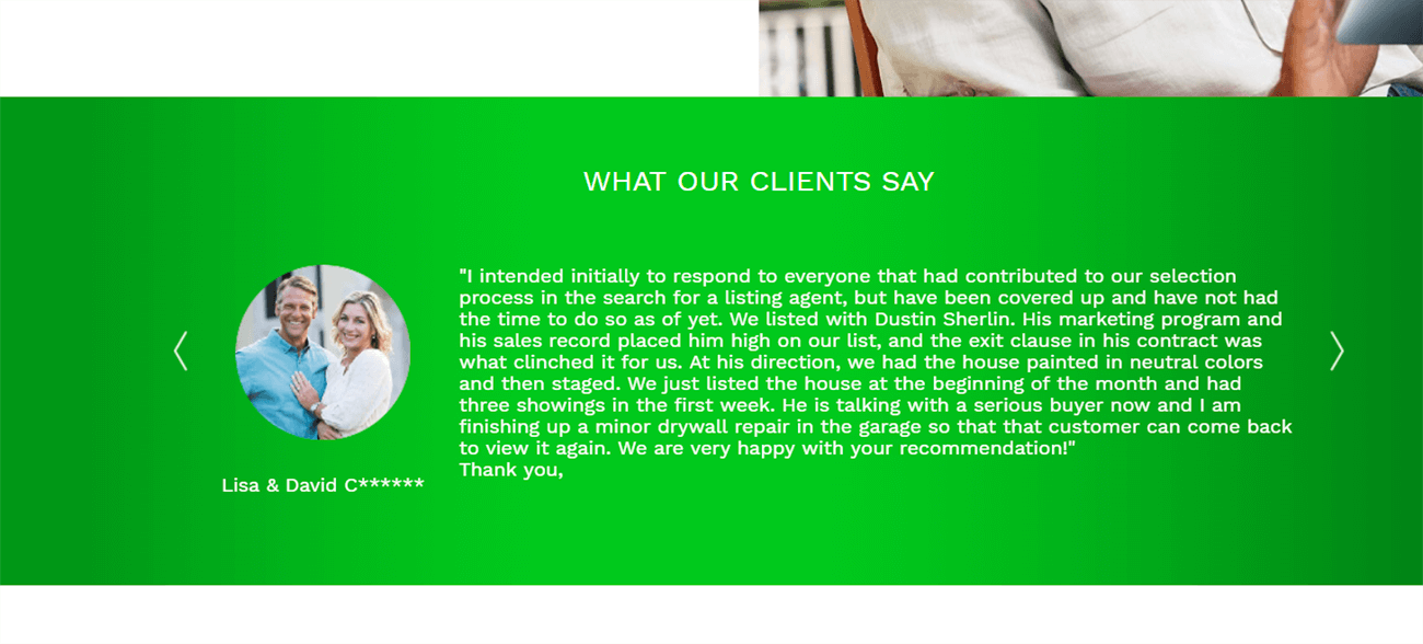
The testimonial includes names and a detailed review. Notice how the couple’s testimonial includes the name of the agent they listed with, what made him effective, and how their plans changed after using this company. It reads like a real review and the inclusion of names (even with the last name blocked out) makes it feel that much more real. The picture doesn’t hurt either!
Many real estate agents say they’re worried about keeping up with technology but, with some effort, you can learn to use technology for the benefit of your business. If you found this article useful, check out some of our other real estate articles, including this one about Powerful Real Estate Marketing Strategies.


