


 Featured Image")
Someone comes across your ad while searching on Google, browsing a website, or watching a YouTube video. The ad is well done–attention-grabbing and relevant to them. They click on it and arrive on your landing page but, for whatever reason, they don’t stay.
The way a landing page is designed can make the difference between someone running for the exit button or someone becoming a new client. Sometimes it can be hard to see what exactly is not working on your landing page. Maybe you have too many links or your call-to-action button is too hard to find or maybe you didn’t match your landing page to the ad that was clicked to get to it.
That’s why this article will help you understand the anatomy of a landing page, based on what type of Google Ad someone has used to get to it.
Landing Page Basics
Just in case you’re not familiar with landing pages, let’s talk about what they are what their purpose is. First, a landing page is not a homepage, though many people use them interchangeably. It’s not a good idea to link your homepage to a paid ad. The number one reason for this is because the purpose of a landing page should be to convert. You want your visitors to click on that call-to-action button.
A homepage’s purpose is different. When someone goes to your homepage, you want them to explore and learn what they can about your business and/or products. For a landing page, it’s better to have as little exits as possible, which means fewer links and ideally no menu buttons.
One of the things that remains true regardless of ad type is the fact that your call-to-action button should stand out and be as easy to find as possible. Don’t make your visitor search for it by forcing them to scroll through your page to find it. When choosing the design for your call-to-action button, make sure the colors fit your color scheme but also stand out.
One more thing to keep in mind is to make sure your landing page is offering your visitors something they want. It’s all about them! Listing your products’ great features but not telling your visitor how it benefits them is missing the point. For example, say someone is trying to start their own e-commerce business and comes across Shopify.
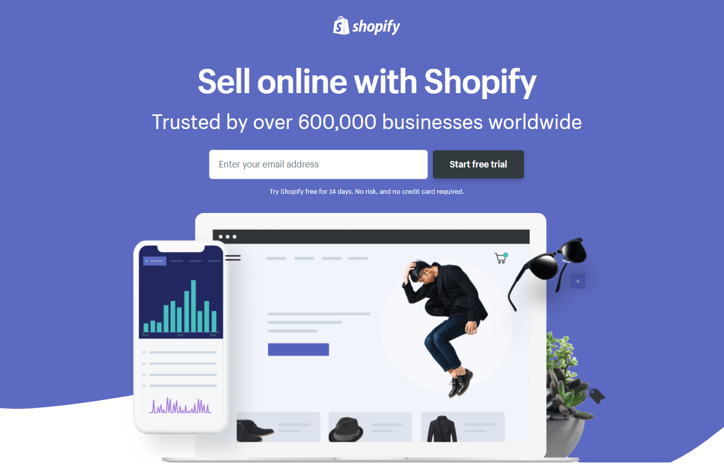
The landing page is so simple yet the design is gorgeous. If you scroll down, the page lists three benefits the visitor will get if they sign up for Shopify:
- Beautiful themes
- Low pricing
- Ease
They tell the visitor their service looks good (which is proven through the design of the landing page), is affordable, and is trustworthy.
A big part of designing your landing page is identifying the way you’ll achieve your goal. Are you offering a free service such as an e-book or video demo? Or are you offering a deal on a product or a free trial on a subscription? Maybe you’re asking them to sign up for your newsletter.
Your landing page will have to spend more time convincing your visitor if you’re trying to sell a product. Build trustworthiness through social proof such as testimonials and reviews. According to BluLeadz, 88% of consumers trust testimonials and reviews.
Look at the difference between Shopify’s landing page and Gobble’s.
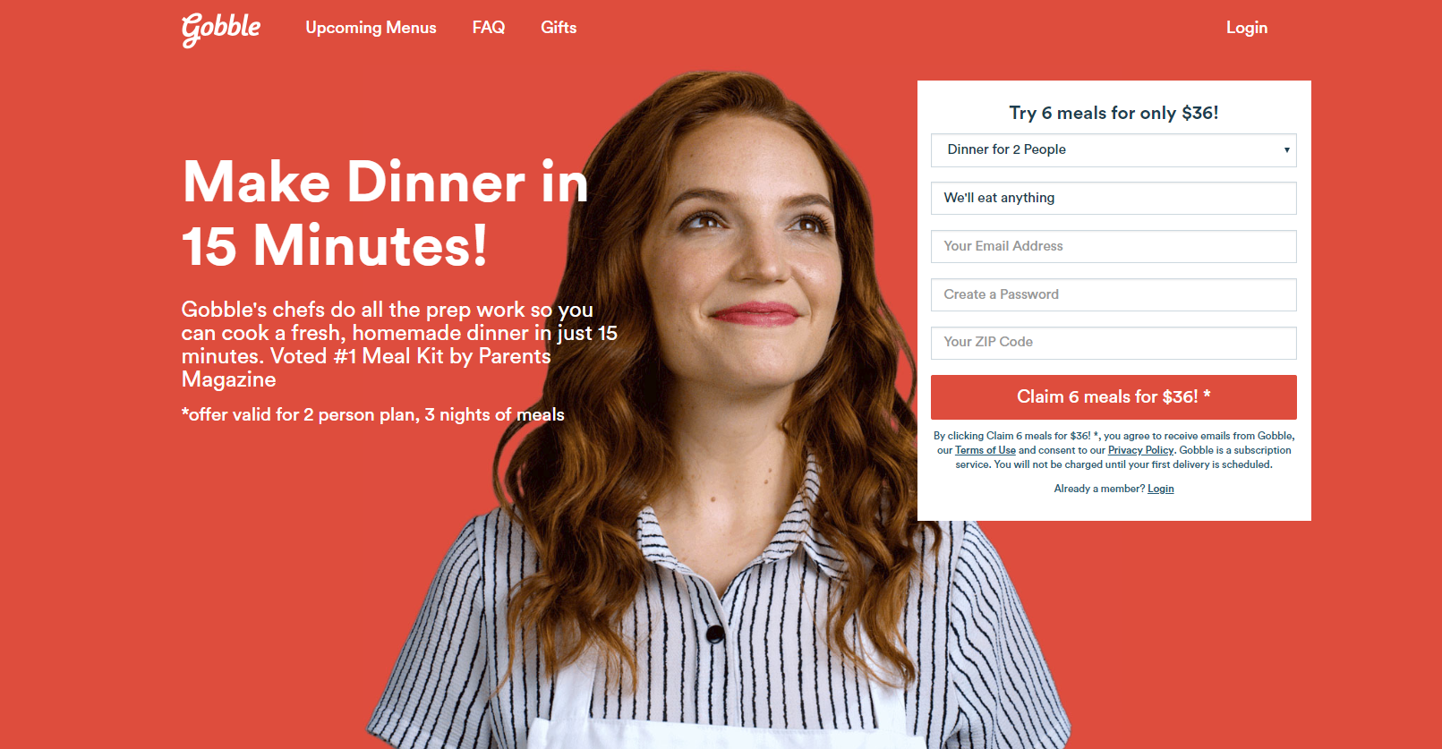
Besides the menu buttons at the top of the page, this landing page is well designed but much longer than Shopify’s. If you scroll down, you’ll find yourself reading about how the subscription service works (through animated images). Lastly, we see a woman drinking wine and smiling while relaxing on the couch.
The landing page is emphasizing the benefit of ease and doing a great job at it. They promise dinner will only take fifteen minutes to cook and that it’s easy to “skip weeks, change dishes, and cancel anytime.”
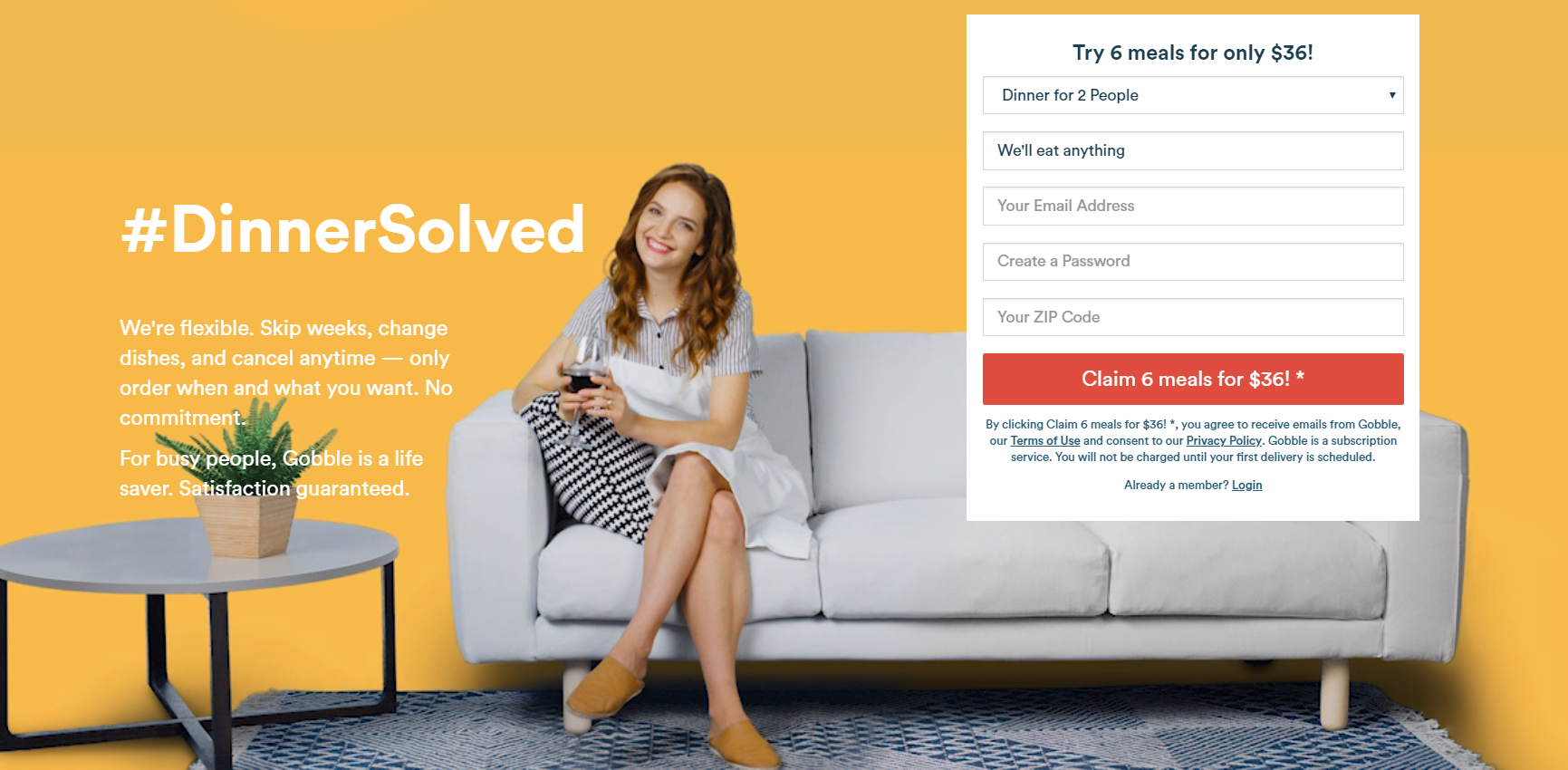
As you can see, because this landing page is working to convince the visitor to buy something, rather than promising a free gift (such as a free trial), it needs to do more work. Cleverly, the form and call-to-action button follow the visitor all through the page as they scroll. It’s never out of sight and it looks like it belongs no matter where you pause in your scrolling.
All of these things influence your visitor’s experience. Of course, you want a visitor to have a positive experience for the sake of conversion, but Google also takes user experience into account when ranking ads on their search network or choosing which banner ads to show on the display network. If you want to be seen on the first page of a search result or you want your ad to be shown on a relevant website, it’s important to make sure you get the best quality score you can.
One way of improving your score is message matching. This is something that might be easy to miss, especially if you’re linking to the same page for multiple ads but it’s also one of the most important steps for keeping visitors from clicking out of your landing page.
Message matching means making sure your ads match with your landing page so your visitors don’t feel tricked, confused, or frustrated. For all ad types, if there’s text on your ad, that text should match the headline of your landing page, for example.
This is another reason why linking to your homepage is not a good idea. It’s unlikely your homepage will deliver on the promises every one of your ads makes or match up visually with all your ad designs.
Message matching is something you need to have in mind when creating landing pages for all of your ads, but there are different things to match up according to ad type. Let’s take a look at some bad and good examples of ads and their landing pages.
Google Ads Search Campaigns and Their Landing Pages
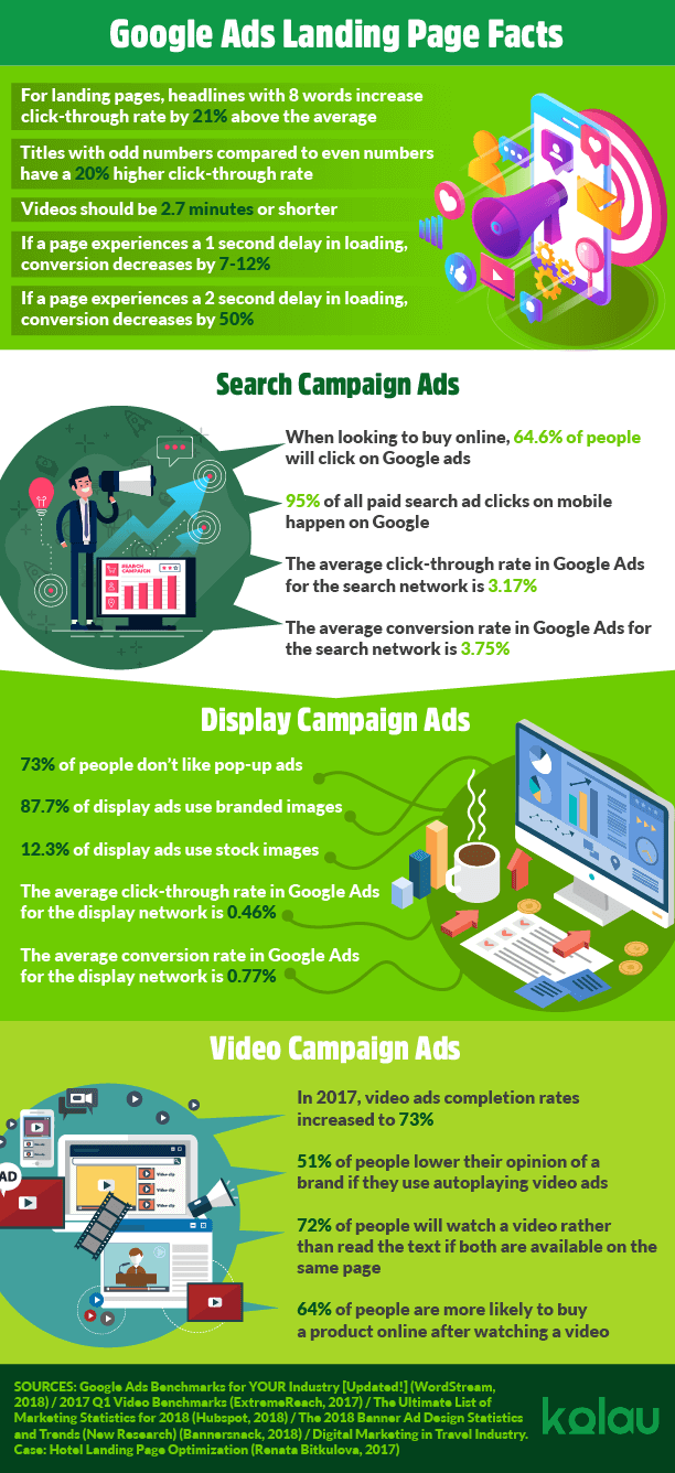
Google Ads lets you create Search, Display, and Video campaigns. For search campaigns, you create text ads that appear when someone searches your keywords on Google Search. With these ads, you’re reliant entirely on text descriptions to get clicks.
Despite the lack of visual advertising, the conversion rate for search campaign ads is higher than that of display ads (3.75% vs 0.77%). This is because, often, people who click on Google Search ads are in “shopping” mode. They’re looking to buy something while display ads often target people who are simply browsing websites. 64.6% of people in shopping mode will click on a Google ad.
Let’s say someone is looking for a real estate agent and they come across this ad:
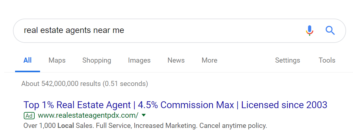
There are some good things to say about the ad. It uses numbers well, grabbing attention. “Licensed since 2003” lets us know they’ve been in business awhile, increasing trustworthiness. The description below is short, though. You should use all of your available space, if possible. It’s also vague. “Full Service, Increased Marketing” is fine but it tells us nothing about what that service consists of.
So, what does the landing page look like?
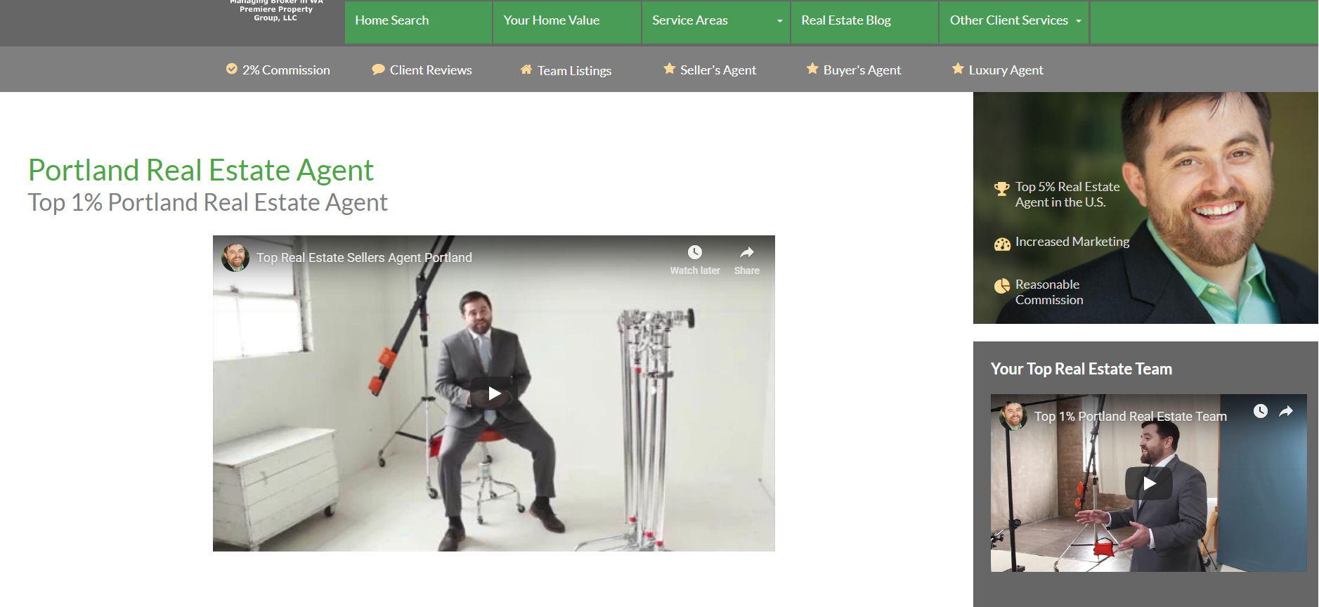
The best way to describe it is busy. If you scroll down, there are paragraph descriptions, a section for reviews, an explanation of what they mean by “increased marketing” and one explaining “full service” plus plenty of videos and links at the top and the right of the page. It looks like a homepage.
If you scroll all the way down to the bottom, you find the call-to-action button.
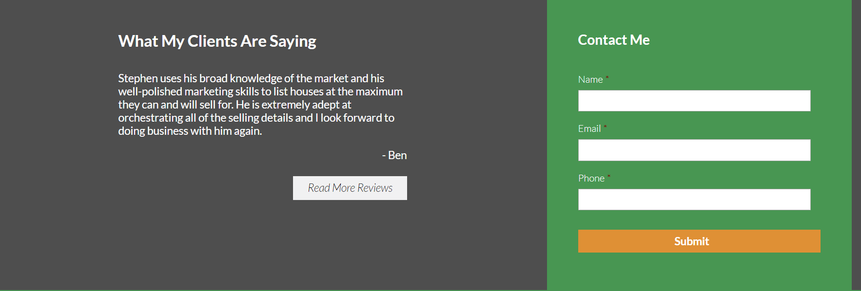
Yes, this landing page covers all it mentioned in the ad, but it’s much too cluttered. Remember: everytime someone clicks on your ad, you pay for it.
You want those visitors to give you their information and you don’t want to make it hard for them to do that. This landing page is longer than the Dyson hair dryer landing page and it’s not selling anything–just asking for contact information.
Shortening paragraphs (or getting rid of them entirely), moving the call-to-action to the top of the page next to the video, and getting rid of all the links around the page would greatly improve this landing page.
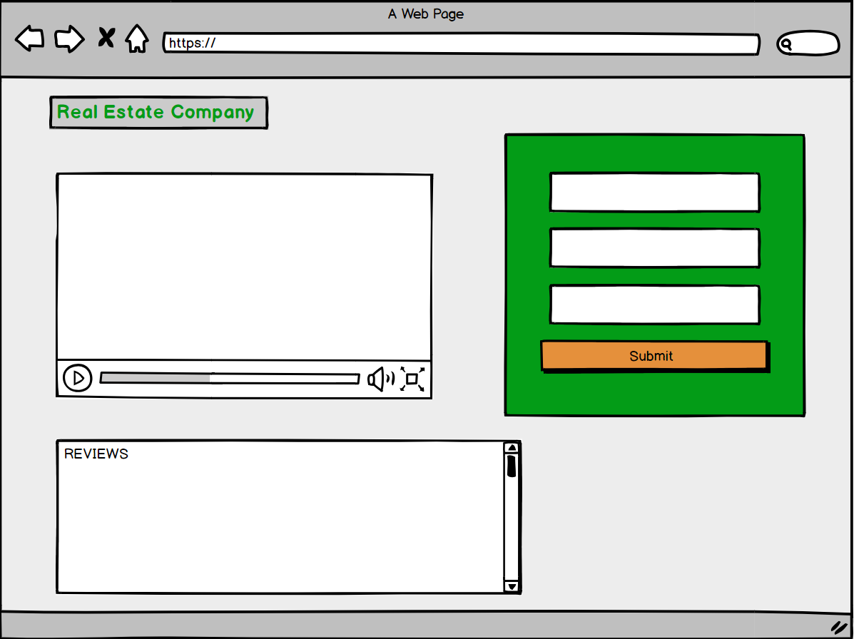
Source: Created using Balsamiq
As an example, moving the call-to-action button and form up to the top of the page would put more attention on it instead of burying it at the bottom. A design more like the one above would be much less overwhelming as well. Including a bit more visuals to back up the promised “top agents” would be fine too but it’s best not to over-explain.
The video pulls a lot of weight! It’s enough to use a video to explain how they’ll increase marketing and provide full service.
The reviews section can help back up their claim about “over 1,000 Local Sales.” So, while many of the aspects on the page are fine individually, together they’re overwhelming and feel disorganized.
Not to mention, the more there is on a page, the more has to load. According to an essay by Renata Bitkulova from Saimaa University, if your page takes longer than 2 seconds to load, 50% of visitors leave.
Another one of the problems with their landing page is that no matter which of their ads is clicked on, it takes you to the same page. Instead of “Real Estate Company,” like in the example, the headline should match the ad and reiterate the benefits it promised.
Now let’s say someone is interested in looking at some fashion magazines and decides to search for Vogue.
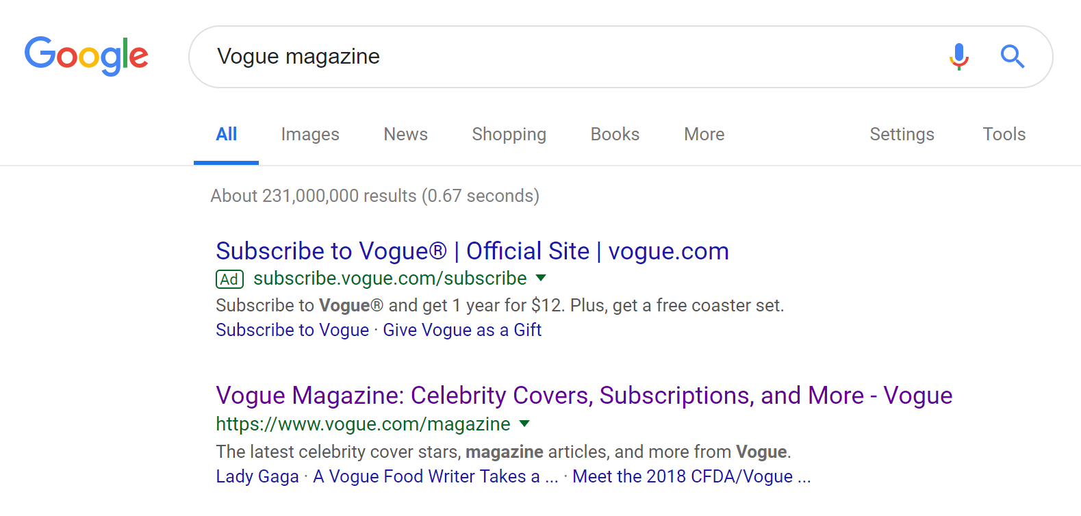
The ad uses the offer of a deal for a subscription as an incentive for a click. They’re offering a one-year subscription for $12 (and a free coaster set). Notice how the ad also has links for subscribing to Vogue and giving Vogue as a gift. What happens when we click on the ad?
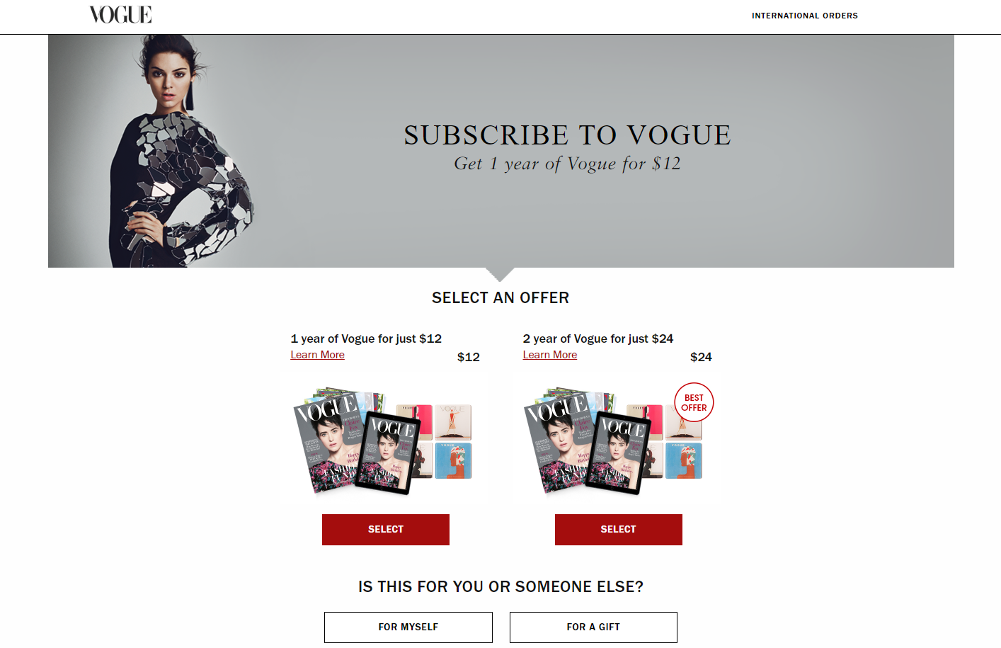
Vogue takes us to an unsurprising landing page, which is a good thing! The ad used an offer to attract a visitor and the landing page fulfills the promise.
We see two offers, the one they mentioned in the ad and an offer for a two-year subscription. Below the offers, we see another promise fulfilled. You have the option to buy the subscription for yourself or as a gift.
This is a good example of message matching. The landing page repeats the words used in the ad, confirming for the visitor that they are in the right place. The headline and subheadline match. The offers are easy to find and there aren’t any obvious exits (the “Learn More” links bring up a pop-up if you hover over them but they are not clickable).
The free coasters are in the image as well (though they are a bit buried). When you select an offer on their page, it opens a form asking you to input your billing information.
Vogue can afford to get straight to the point. They’re well-known enough that it’s likely most people know the kind of content they’ll be getting despite the lack of information on the landing page. Another landing page whose goal is to convince visitors to purchase something should try to include some form of social proof or point out benefits.
Google Ads Display Campaigns and Their Landing Pages
Display ads are what you see when you’re scrolling through a website and see a banner ad at the top or side of the page. They’re more visual, reliant on images (and, at times, text). As mentioned earlier, display (or banner) ads have lower conversion rates than text ads because they are usually shown to people who are not in “shopping” mode.
When creating your display campaign, do not choose to create pop-up ads. According to Hubspot’s 2018 marketing statistics, 73% of people dislike pop-up ads and 81% have closed out of a webpage because of a pop-up. If your display ad is also a video ad, be aware that 51% of people have lowered their opinion of a brand if they used auto-playing video ads.
The trick here is to market to the right people. Make different ads for different demographics. People should relate to the ad they’re seeing somehow. If you’re targeting women in their 20s to 30s, feature someone who may look like them in your ad.
Many banner ads don’t get clicks because they’re targeting the wrong people or just putting their ads out there without a strategy. Think about how many times you’ve seen a banner ad that had absolutely nothing to do with the site you were on or had been on. How many times have you seen banner ads that had nothing to do with your interests or shopping needs?
At the time of writing this article, it was tax season. So, this ad kept popping up:
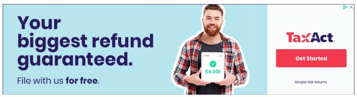
It’s the perfect time to be seeing this ad. It features a smiling man holding what we assume is his tax return. This is clarified by the promise “Your biggest refund guaranteed.” So, what does the landing page look like?
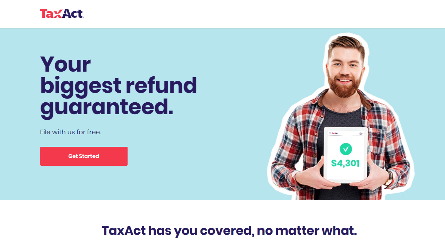
It looks almost exactly like the ad except it provides the visitor with a bit more information and the option to sign up. What’s perfect about this landing page is how much it matches up with the banner ad. The man in the picture is the same as the man on the landing page. The colors are the same. The promise is the same. If you scroll down, the page lists prices, reasons to switch to TaxAct, and an accuracy guarantee.
Another way to take advantage of display advertising is to utilize retargeting methods. That means if someone clicks on a product, for example, but doesn’t go all the way through the checkout, you can use retargeting to remind them to come back and purchase it. Banner ads will appear on websites they browse, customized to showcase the exact product they have yet to purchase.
Google Ads Video Campaigns and Their Landing Pages
Video campaigns are video ads that Google runs on YouTube before another video. The length of the video ad varies but usually, they’re short enough to fit all the important information before the “Skip Ad” button appears on the video. Sometimes, video ads will encourage viewers to stay past the necessary time with the promise of a benefit.
Videos can be used as a great marketing strategy if done well. According to a benchmark report by ExtremeReach, in 2017, the completion rate for videos rose to 73%. People would also rather watch a video than reading a text. According to Hubspot, 72% of people prefer to watch videos opposed to reading text when both are available.
Let’s go through a couple of examples and what they’re doing well and what should be worked on.
This is what an ad by Marketo looks like:
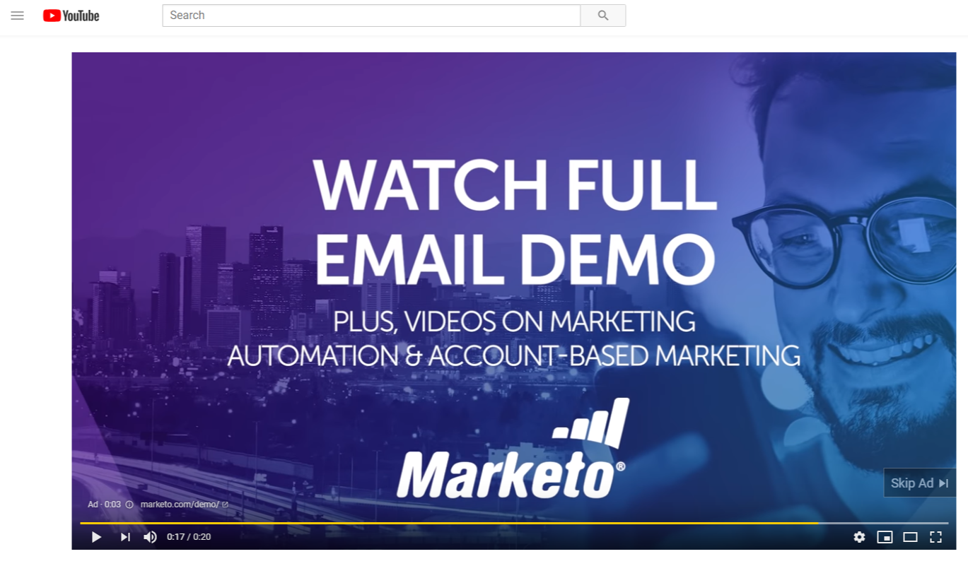
The video itself ends suddenly (for the purpose of advertising the full video at the end). Once you click on the ad, it takes you to a landing page that looks like this:
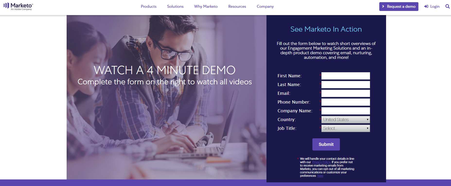
The color scheme matches the video’s, so that’s good. The man we see on the landing page looks like the one we see at the end of the video as well, showing the visitor they’re in the right place. It also fulfills its promise, offering the full version of their demo (plus their other videos).
Is it worth it, though? The video is only four minutes long–not much of an incentive. Also, take a look at the amount of information you’re required to enter to even get there. There are seven form fields.
Though the average is eleven, reducing the number of form fields down to 4 can increase conversions by 120%. It would have been a better strategy to give the visitor the whole video and ask them to sign up to see more videos like it. This kind of landing page is likely to make your visitor frustrated.
Not only that, there are so many ways to leave the page. All those links in the menu are ways for visitors, who could already be overwhelmed by the amount of information they’re required to give up, to click out and forget about those video demos that attracted them to the page in the first place.
So, here’s an ad that does it better.
Below is a video ad for Monday.com, a project management tool. The beginning of the video is fast-paced and honest, grabbing attention right away. It quickly explains what the ad is for and then tells the viewer how the tool will make them feel. Immediately, we see the benefits shown to us through clever visual examples.
The video ad doesn’t begin explaining to us how the tool works until they’ve properly captured the viewer’s attention. Once there, they make the function of their program look very simple. The narrator continues to emphasize the benefits the visitor will get, saying, “You’ll never drop the ball on the important stuff again.”
So what happens when we click on the ad? It takes us to this landing page:
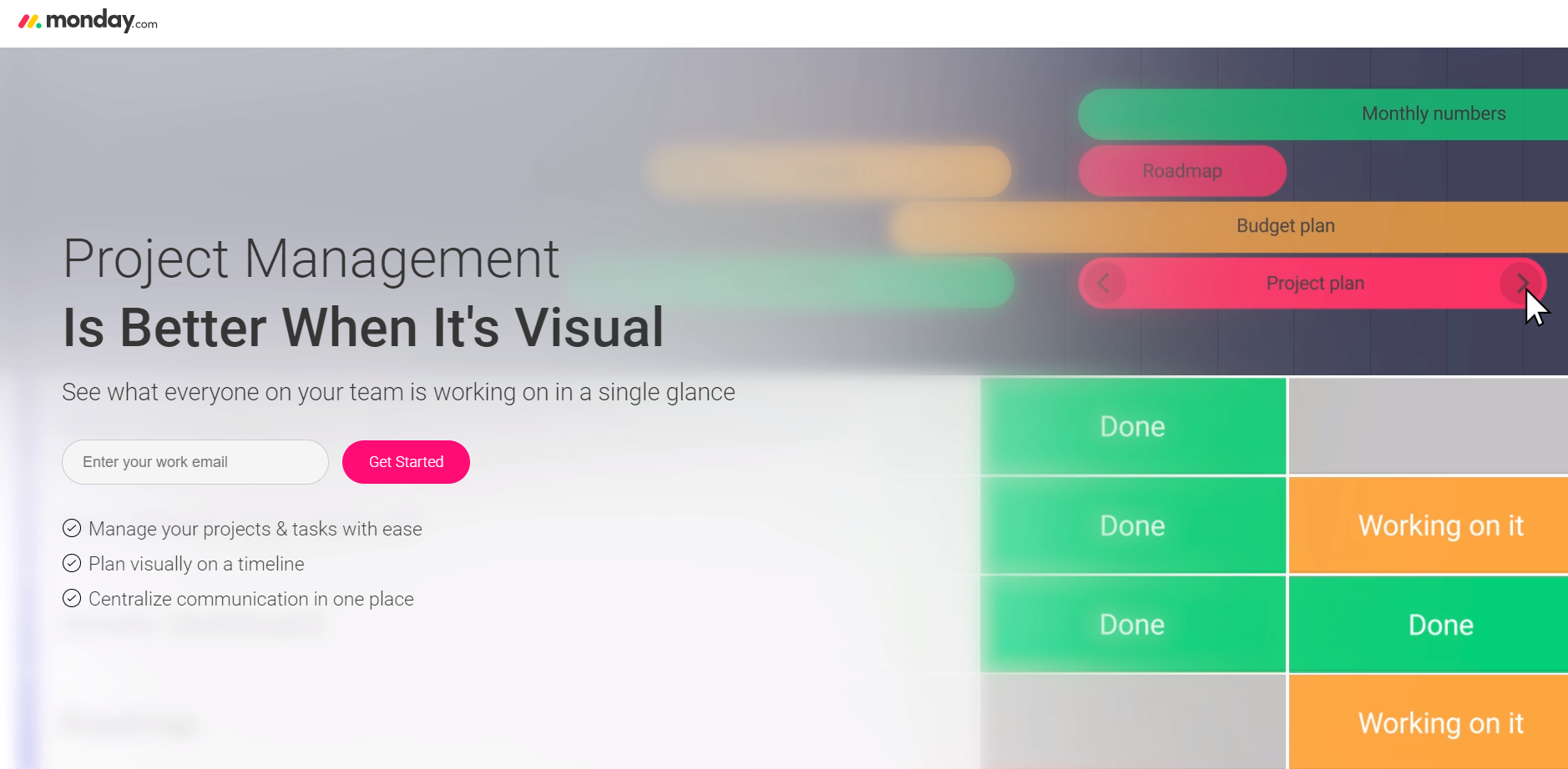
The landing page connects the visuals of the video by using an animated image instead of a still image. We see a closeup of the functionality of the program in the background.
Not only that, the image they chose matches with their headline–”Project Management Is Better When It’s Visual.” There are no obvious exits. In fact, the page is short and offers no scrolling–a good choice because it doesn’t need it.
The landing page itself is great. It has an obvious call-to-action button, the form only has one requirement, and below, it lists the benefits offered if you sign up. The imagery is pleasant and relevant as well.
There are a few things that could be improved to match up with the ad that brought us here. For one, the only terms that match up with things we heard in the ad are “project management” and the name of the service. Though the headline “Project Management Is Better When It’s Visual” is great, the visual aspect was implied in the video but not emphasized the way the feel of it was.
The ending line of the ad–”You’ll never drop the ball on the important stuff again”–is also forgotten. Reminding the visitor about the feeling of satisfaction or mentioning again how Monday.com will solve the pain point of forgetting some of your tasks would reassure the visitor they’ll be getting what the ad promised.
As you can see, message-matching is very important when creating your landing pages. It can be easy to forget to consider each ad you create, which is why you shouldn’t have one landing page for all your ads. Your visitor puts trust in you when they click on your ad and you don’t want to betray that trust as soon as they arrive on your landing page.
If you think you’ve got landing pages down and are ready to learn more about marketing online, check out our article on Social Media Strategies for Small Businesses.


